Effective color mixing requires a strategic combination of traditional and digital tools to achieve precise, consistent results. Essential equipment includes high-quality primary and secondary pigments, palette knives, non-porous mixing surfaces, and accurate measuring devices like syringes or digital scales. Modern solutions incorporate automated mixing machines, spectrophotometers for exact color matching, and color management software that maintains digital libraries and tracks costs. Professional-grade tools enable systematic blending procedures while reducing material waste by up to 63% through bulk packaging options and improved inventory management. These foundational elements form the cornerstone of successful color formulation, with advanced techniques offering even greater precision and creative possibilities.
Primary Color Relationships
Understanding primary color relationships begins with the fundamental trio of red, yellow, and blue – colors that cannot be created by mixing other hues. These elemental colors serve as the foundation for all color mixing endeavors, enabling artists and designers to create an extensive spectrum of secondary and tertiary colors through systematic combinations.
The relationship between primary colors manifests in three critical aspects:
- Spatial Distribution – Primary colors are positioned equidistantly on the color wheel, forming an equilateral triangle that guarantees balanced color distribution
- Mixing Potential – Each primary color combines with another to produce distinct secondary colors: red and yellow create orange, blue and yellow form green, and red and blue generate violet
- Intensity Influence – The proportion of each primary color in a mixture directly affects the resulting hue's intensity and character
These relationships form the basis for understanding color theory and facilitate the creation of harmonious color schemes. When working with primary colors, it is crucial to recognize their inherent properties and how their interactions influence the final outcome of any color mixing project. The study of these relationships dates back to Aristotle's early observations of color behavior and interaction.
Complementary Color Combinations
Mastering complementary color combinations requires a firm grasp of color wheel fundamentals and their opposing relationships. These color pairs, positioned directly opposite each other on the color wheel, create maximum contrast and visual impact when properly implemented. By identifying complementary pairs such as red-green, blue-orange, and yellow-purple, designers can strategically enhance their work's visual hierarchy and emotional resonance. For example, the combination of charcoal and yellow creates a bold, eye-catching look that communicates both professionalism and creativity.
To effectively utilize complementary colors, practitioners must understand the geometric principles that govern their relationships. This involves traversing the color wheel with precision, moving 180 degrees from the base color to locate its complement. Professional color harmony tools and calculators can facilitate this process, ensuring accuracy in color selection and implementation.
The successful application of complementary colors demands careful attention to balance and proportion. By adjusting saturation levels, values, and tones, designers can create sophisticated arrangements that avoid visual fatigue while maintaining impact. This approach proves particularly valuable in branding and logo design, where the strategic use of complementary colors can establish memorable visual identities. The key lies in maintaining appropriate dominance relationships between the chosen colors while incorporating variations in intensity to achieve an ideal visual harmony.
Tertiary Color Creation
Creating tertiary colors involves a methodical mixing process that combines primary and secondary colors in equal proportions. This precise combination yields six distinct tertiary colors: red-orange, yellow-orange, yellow-green, blue-green, blue-violet, and red-violet, each positioned strategically between primary and secondary colors on the color wheel.
For essential tertiary color creation, artists should follow these key steps:
- Select pure, high-quality primary and secondary colors to guarantee optimal mixing results
- Measure equal portions of each color using a palette knife or specialized color mixing tools
- Blend thoroughly on a clean mixing surface, gradually incorporating the colors until achieving uniformity
Understanding the relationship between colors on the wheel enables artists to create sophisticated color harmonies and balanced compositions. When working with tertiary colors, it's vital to contemplate saturation levels and their impact on the overall artwork. To achieve more nuanced results, artists can modify tertiary colors by incorporating white for tints, black for shades, or complementary colors for muted tones. This systematic approach to color mixing provides artists with expanded creative possibilities while maintaining color harmony.
Benefits

The strategic use of color mixing tools offers significant advantages for both amateur and professional artists, including substantial time and cost savings through efficient pigment management alongside improved accuracy in color matching.
Professional-grade mixing tools enable artists to achieve precise color control, resulting in consistent and repeatable results that meet industry standards. These specialized implements not only enhance the creative process by providing artists with greater flexibility in color selection and application but also contribute to achieving professional-quality outcomes that would be difficult to attain through traditional manual mixing methods.
Time and Cost Savings
While traditional color mixing methods can be time-consuming and costly, modern color mixing tools offer significant advantages in both efficiency and expense reduction. Automated color mixing machines and digital management systems streamline operations by providing precise measurements and instant access to color formulas, drastically reducing the time spent on manual mixing processes while minimizing waste through accurate pigment dispensing.
The implementation of color management tools delivers measurable savings through:
- Reduced material waste by up to 63% when utilizing bulk packaging options and automated dispensing systems
- Enhanced inventory management capabilities that prevent unnecessary purchases and stockouts
- Decreased labor costs through automated mixing processes and quick-access digital color libraries
These technological solutions not only optimize operational efficiency but also contribute to substantial cost reduction through precise measurement and mixing abilities. The integration of online color mixers enables rapid experimentation without physical waste, while color management software guarantees accurate cost tracking and pricing. Additionally, automated systems facilitate bulk mixing options for resins and maintain consistent quality across multiple batches, effectively reducing both time investment and material expenses while maintaining professional standards.
Improved Color Accuracy
Precision in color accuracy stands as a fundamental benefit of modern color mixing tools, offering professionals unprecedented control over their creative output. Through advanced calibration systems and ICC profiles, these tools enable consistently accurate color reproduction across various devices and mediums, maintaining Delta E values of 2 or lower for ideal accuracy. Industry professionals can now achieve exact color matches that align perfectly with standardized color spaces like Adobe RGB and P3.
The implementation of sophisticated color mixing tools ensures that the final output precisely matches the intended design, whether viewed on calibrated monitors or in printed form. These tools facilitate meticulous color correction during post-production, allowing for adjustments that compensate for technical variations while maintaining true-to-life color representation. Professional-grade equipment, coupled with standardized measurement tools, enables creators to achieve and maintain precise color accuracy throughout their workflow.
This level of precision proves particularly important for brands requiring consistent color reproduction across multiple platforms and locations, guaranteeing their visual identity remains intact regardless of the production environment or output medium.
Better Creative Control
Modern color mixing tools empower creative professionals with unprecedented control over their artistic expression, offering a robust framework for experimentation and innovation. Through advanced color management systems and automated mixing equipment, artists and designers can achieve precise control over their creative processes while maintaining consistency across projects.
The integration of digital color management and smart sensing technologies enables:
- Exhaustive exploration of color combinations through subtractive mixing of cyan, magenta, and yellow, facilitating the development of unique design solutions
- Precise manipulation of color ratios and gradient shifts, allowing for nuanced adjustments in tone, temperature, and intensity
- Systematic organization of color palettes and mixing formulas, ensuring reproducibility and maintaining quality standards across multiple applications
These sophisticated tools support the creation of varied color spectrums while minimizing waste through efficient resource utilization. The ability to generate and manage custom color combinations, coupled with automated mixing capabilities, enables professionals to focus on creative development rather than technical execution. This enhanced control over the color mixing process ultimately leads to more refined and impactful visual compositions, elevating the quality of artistic and commercial projects.
Professional-Quality Results
Excellence in color mixing culminates in professional-quality results through an extensive suite of advanced tools and techniques. Three-dimensional LED technology in devices like the Pablo Digital color shade scanner delivers precise color measurements across complex surfaces, while calibration-free sensors sustain consistent accuracy throughout multiple applications. The integration of thorough color databases, including Scala, RAL, and NCS systems, guarantees exact shade matching for every project.
Professional results are further enhanced through state-of-the-art mixing machines and standardized high-quality tinting pastes, which eliminate variations in color consistency. The implementation of the Basecode system, utilizing a strategic first coat, establishes ideal hiding power and surface uniformity. Advanced coating techniques, combined with high-performance materials, certify superior coverage even on challenging surfaces.
These professional tools are complemented by sophisticated digital applications that facilitate precise color matching and documentation of custom formulations. The systematic approach extends to aftercare, with specialized maintenance protocols and product recommendations ensuring the longevity of color applications, while ongoing access to expert consultation provides support for achieving and maintaining exceptional results.
Color Temperature Basics
Color temperature fundamentally shapes how we perceive and work with color in both natural and artificial environments, operating on a scale measured in degrees Kelvin (K). Understanding the relationship between warm and cool temperatures enables artists and designers to create harmonious color compositions, with warmer colors typically falling below 4000K and cooler colors residing above 5000K. The manipulation of color temperature serves as an essential tool in color mixing, influencing everything from the psychological impact of a space to the technical accuracy of photographic reproduction.
| Temperature Range | Characteristics and Applications |
|---|---|
| 1800K – 3000K | Warm, intimate lighting ideal for residential spaces; creates cozy atmospheres |
| 3000K – 4500K | Neutral white light suitable for retail and office environments |
| 4500K – 6500K | Cool, crisp lighting that enhances focus and productivity |
| 6500K – 10000K | Very cool light that mimics overcast sky conditions and specialized applications |
Understanding Warm Vs Cool
Understanding the relationship between warm and cool colors forms the foundation of effective color mixing and composition. When working with colors, artists must recognize that warm colors, characterized by red, orange, and yellow undertones, tend to advance in a composition, while cool colors recede. This fundamental principle enables artists to create depth and dimensional effects in their work through strategic color placement and temperature manipulation.
Color bias and undertones play a vital role in determining how colors interact when mixed. Consider these essential aspects of color temperature:
- Warm colors typically create intimate, energetic spaces and are most effective in foreground elements
- Cool colors establish depth and atmospheric perspective, making them ideal for background elements
- The interaction between warm and cool colors can be leveraged to create sophisticated color harmonies and dynamic visual effects
Professional artists particularly benefit from understanding how different light sources affect color temperature perception. Natural lighting reveals true color temperatures, while artificial lighting can drastically alter how warm and cool colors appear. This knowledge becomes especially valuable when mixing colors to achieve specific undertones or when working to create harmonious compositions that maintain their intended effect under various lighting conditions.
Primary Temperature Relationships
The fundamental relationships between primary colors' temperatures form a critical framework for artists and designers seeking mastery in color mixing. Understanding these relationships enables practitioners to achieve precise color combinations and maintain chromatic harmony within their work. The temperature characteristics of primary colors directly influence the clarity and vibrancy of secondary colors produced through mixing.
When analyzing primary temperature relationships, artists must consider that each primary color exists on a spectrum between warm and cool variations. For instance, a warm red exhibits orange undertones, while a cool red demonstrates purple influences. This temperature variance greatly affects mixing outcomes, as combining primaries with compatible temperature characteristics produces more vibrant secondary colors. Conversely, mixing primaries with conflicting temperatures often results in muted or muddy hues.
The practical application of primary temperature relationships extends beyond basic color theory. By selecting primaries with intentional temperature characteristics, artists can achieve specific aesthetic goals, such as creating atmospheric depth or emphasizing focal points. This systematic approach to temperature relationships enables precise control over color mixing outcomes, ultimately leading to more sophisticated and nuanced artistic expressions.
Color Temperature Impact
Light's temperature characteristics form the foundation of how we perceive and work with color in both natural and artificial environments. Measured in degrees Kelvin (K), color temperature provides a scientific framework for understanding the subtle variations in light quality, from the warm glow of candlelight at 1850K to the cool brilliance of midday sun at 6500K. This understanding becomes essential when selecting and manipulating colors for various applications.
The impact of color temperature manifests in three critical ways:
- Psychological response – warmer temperatures (2700-3000K) create intimate, relaxing environments, while cooler temperatures (5000-6500K) promote alertness and productivity
- Visual perception – different color temperatures affect how we perceive object colors and material textures
- Technical considerations – proper temperature selection guarantees accurate color reproduction in photography and digital displays
Understanding these relationships enables innovative approaches to color mixing and manipulation. By deliberately controlling color temperature, artists and designers can achieve precise emotional responses and functional results. This knowledge becomes particularly valuable when working with mixed media or creating environments that require specific atmospheric conditions for optimal visual impact.
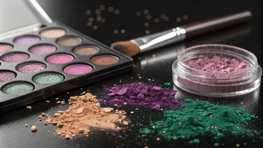
Top Beauty Brands
As a trusted partner in color mixing solutions, we offer expert guidance and professional tools to help you achieve perfect color combinations for your beauty products. Drawing inspiration from leading beauty brands like Rare Beauty, Fenty Beauty, and Charlotte Tilbury, our services include precise pigment blending, customized foundation matching, and innovative mixing techniques that guarantee consistent results.
Our specialized equipment and professional expertise enable both established beauty brands and emerging cosmetic companies to develop unique color palettes, match diverse skin tones, and create trendsetting products that meet the demanding standards of modern consumers, particularly the discerning Gen Z market. We utilize advanced technology and industry-standard practices to help our clients achieve the same level of product excellence demonstrated by top beauty innovators, ensuring your color mixing needs are met with precision and dependability.
Mixing With Professional Pigments
When working with professional pigments, understanding the nuances of pigment load ratios, quality versus cost factors, and binder selection is essential for achieving ideal color mixing results.
| Pigment Load Ratios | Quality Vs Cost Factors | Binder Selection Guide |
|---|---|---|
| High pigment load: Phthalo Blue, Phthalo Green | High-quality pigments: Lightfast, durable | Acrylic: Water or polymer binder |
| Moderate pigment load: Naphthol Red Light, Quinacridone Magenta | Cost-effective alternatives: Lower lightfastness, less durable | Watercolor: Gum arabic binder |
| Low pigment load: Benzimidazolone Yellow Medium | Balancing quality and cost: Mixing high and low-quality pigments | Oil and Gouache: Linseed oil or gum arabic binder |
| Adjusting ratios for desired hues | Testing for color consistency and stability | Considering medium-specific binders for optimal performance |
| Recording mixing ratios for reproducibility | Evaluating manufacturer specifications | Ensuring compatibility between pigments and binders |
Understanding Pigment Load Ratios
Understanding pigment load ratios stands as a fundamental concept for artists working with professional pigments, since these ratios directly influence the intensity, durability, and mixing behavior of paints. The Pigment Volume Concentration (PVC) represents the relationship between pigment and binder volumes, with the Critical Pigment Volume Concentration (CPVC) indicating the vital balance point for maximum color performance.
Professional artists must consider three essential aspects when working with pigment loads:
- Different pigments possess varying oil absorption rates, affecting their optimal ratios (e.g., Hansa Yellow Light at 60% versus Phthalo Blue RS at 40%)
- Higher pigment loads generally result in enhanced lightfastness and improved tinting strength
- Exceeding the CPVC can lead to diminished paint film durability and altered surface characteristics
Understanding these relationships enables artists to achieve precise color mixing results while maintaining proper paint consistency. For instance, when combining high-tinting-strength pigments like Phthalo Blue with weaker tinting colors, knowledge of their respective pigment loads becomes essential for achieving balanced mixtures. This technical understanding translates directly into more efficient paint usage and superior color stability in finished works.
Quality Vs Cost Factors
The selection of high-quality paint mixing tools represents a critical investment decision for artists working with professional pigments. While premium equipment such as unglazed porcelain mortars, glass mullers, and precision dispensers may require substantial initial capital, their long-term value proposition extends beyond mere durability. These instruments facilitate superior pigment grinding, ensuring consistent particle size and ideal color development.
Professional-grade tools directly impact the precision and reproducibility of color mixing outcomes. High-quality grinding plates and mullers enable artists to achieve uniform pigment dispersion within binding mediums, resulting in predictable and stable color formulations. The textured surfaces of glass mullers, combined with durable grinding plates, provide the necessary friction for thorough pigment incorporation while maintaining material integrity through repeated use. Additionally, precise dispensing systems enable accurate medium-to-pigment ratios, essential for maintaining consistency across multiple batches. When evaluated against the potential costs of inferior results, material waste, and frequent replacements, investing in professional-grade tools emerges as a strategically sound decision that enhances both the technical and artistic aspects of color mixing processes.
Binder Selection Guide
Selecting appropriate binders for professional pigments requires careful consideration of multiple chemical and performance factors to achieve ideal results. Understanding the compatibility between binders and pigments is indispensable for maintaining color stability, durability, and overall coating performance. Professional artists and paint manufacturers must evaluate environmental conditions, application requirements, and specific performance needs when choosing between latex, oil-based, or polymeric binding systems.
When selecting binders for professional pigment applications, consider these essential factors:
- Solid-to-liquid ratio optimization: Higher quality formulations require precise balancing of pigments and binders to achieve superior coverage and application properties
- Environmental resistance capabilities: Select binders that provide adequate protection against UV radiation, moisture, and temperature fluctuations specific to the intended use
- Compatibility assessment: Ensure chemical compatibility between chosen binders and pigments to prevent separation, settling, or adverse reactions during mixing and application
Advanced binding systems, particularly those incorporating polyacrylates and modified polymeric compounds, offer enhanced performance characteristics such as improved adhesion, superior stain resistance, and exemplary flow properties. These sophisticated binders enable precise control over gloss levels and film integrity while maintaining consistent pigment distribution throughout the coating system.
FAQ
How Long Does Mixed Color Last Before It Starts to Separate?
Mixed color stability varies by paint type: acrylics remain stable indefinitely when properly mixed, oils last months, while water-based paints like gouache may separate sooner unless stored in controlled conditions.
Can I Fix a Color Mixture if I Add Too Much Pigment?
Yes, you can correct over-pigmented mixtures by adding white or base colors to lighten them, or by incorporating complementary colors to achieve balance and desired tonal quality.
What Surfaces Are Best for Mixing Different Types of Color Mediums?
Glass palettes and ceramic tiles offer ideal mixing surfaces for various mediums, while disposable palette paper works well for acrylics. Specialized mixing trays provide separate wells for controlled experimentation.
Should Room Temperature Affect My Color Mixing Process?
Room temperature greatly impacts paint viscosity, drying time, and pigment behavior. Maintaining consistent, controlled temperatures guarantees reliable color mixing and superb results across different paint mediums.
Are There Specific Brushes Required for Mixing Different Color Consistencies?
No specific brushes are required for mixing color consistencies. The focus is on mixing tools like virtual mixers, color wheels, and software that accurately blend colors regardless of consistency.