
To achieve seamless blending with pastel shades, start by establishing primary values on a properly primed surface using a methodical layering approach. Apply colors in circular motions, working from light to dark while using quality soft blending tools to maintain smooth transitions. Proper preparation of the surface, whether canvas or other medium, with materials like gesso ensures ideal color adherence and blending capability. Organization of pastels by color family and value helps maintain efficiency during application. Professional-grade tools and systematic application techniques create depth and dimension while maintaining the delicate nature of pastel hues. These foundational principles lead to increasingly refined results.
Blend Light to Dark
The art of blending pastels from light to dark shades requires a methodical and gentle approach to achieve seamless shifts. By understanding the fundamental principles of color layering and pressure control, artists can create sophisticated gradients that enhance their artistic compositions. The process begins with establishing lighter base tones and gradually introducing darker values while maintaining precise pressure control throughout the application. Workable fixative can be applied between layers to preserve the integrity of transitions.
To execute this technique effectively, artists should utilize appropriate blending tools such as fingers for larger areas or blending stumps for more precise work. The application of scumbling techniques proves particularly valuable when migrating between light and dark values, as it allows for subtle tonal variations through the careful layering of opaque pigments.
When working with harder pastels, implementing feathering strokes helps build depth while maintaining control over the color progression. Surface selection plays a pivotal role, with sanded or textured papers providing ideal tooth for pastel adherence and blending capabilities. Artists should remain mindful of material consistency, selecting pastels of similar hardness to prevent unwanted displacement of underlying layers and maintain the integrity of their color shifts.
Circular Motion Application
Mastering circular motion application represents a fundamental technique in pastel artistry, particularly for achieving gentle color mixing and seamless shifts. This method involves applying colors directly to the working surface and blending them through precise, controlled circular movements using primarily the fingertips, which offer superior control and sensitivity during the blending process.
The effectiveness of circular motion application lies in its ability to create smooth transitions between colors while maintaining the integrity of the pastel pigments. Artists begin by laying down the lightest shade first, followed by subsequent colors, working them together through deliberate circular movements that gradually blend the pigments. Similar to wet-on-wet blending, this approach allows artists to work with colors while they're fresh and malleable. This technique proves especially valuable when creating subtle gradations and avoiding harsh transitional shifts that can detract from the artwork's professional finish.
For ideal results, practitioners should maintain consistent pressure while executing the circular motions, particularly in areas requiring detailed attention. The technique allows for real-time adjustments and precise control over color intensity, making it essential for achieving professional-grade blending in pastel artwork. When combined with proper finger pressure, this method ensures the preservation of pastel pigments while facilitating seamless color integration.
Use Quality Soft Tools
Quality blending tools serve as essential instruments for achieving sophisticated color shifts in pastel artwork. Professional artists frequently employ specialized implements such as blending stumps, which offer precise control for detailed work, particularly on sanded surfaces where intricate color metamorphoses are desired. These tools, available in various sizes and tip configurations, enable artists to achieve nuanced gradations while maintaining the integrity of the pigment layers.
For broader applications, cotton swabs present an effective alternative, allowing gentle manipulation of pastel pigments without excessive pressure that might compromise the artwork's surface. When combined with protective gloves to prevent oil transfer, artists can utilize their fingers for expansive areas requiring smooth value alterations, while paper-based tools offer adaptability for medium-sized sections. The strategic implementation of these tools, particularly when integrating pastel-on-pastel techniques, enables artists to maintain the medium's characteristic luminosity while achieving seamless color integration.
Benefits
Mastering the art of blending pastel shades offers significant advantages for both professional designers and home decorators, including the ability to create sophisticated color shifts that enhance interior spaces.
The seamless integration of pastel tones contributes to a more refined aesthetic while establishing serene, balanced environments that promote relaxation and visual harmony. These professional-grade blending techniques result in polished, expertly-finished surfaces that elevate the overall design quality and create lasting impressions in any room.
Soft Color Transition Skills
The art of creating soft color shifts with pastels offers numerous advantages for artists seeking to elevate their work. Through the implementation of precise layering techniques and strategic color placement, artists can achieve seamless shifts that enhance the overall visual impact of their compositions. The process begins with selecting high-quality soft pastels, which provide superior pigmentation and blending capabilities essential for professional results.
To master soft color shifts, artists must develop a systematic approach that incorporates both technical precision and measured application. Beginning with the lightest shade, artists apply gentle pressure while working in circular or sweeping motions, gradually building intensity through subsequent layers. The integration of appropriate blending tools, such as stumps or tissue, facilitates the smooth merger of overlapping colors. This methodical process, combined with attention to stroke direction, ensures the removal of harsh lines and creates subtle gradations between hues. Artists utilizing hard pastels for detailed work must exercise particular care in maintaining consistent pressure and movement to achieve comparable smoothness in their shifts, though these materials generally prove more challenging for blending purposes than their softer counterparts.
Enhanced Interior Design Appeal
Beyond artistic applications, pastel shades serve as powerful design elements that transform interior spaces with their sophisticated appeal. These versatile hues demonstrate remarkable adaptability across various design styles, from minimalist contemporary to traditional aesthetics, while maintaining their timeless charm. The integration of pastel colors creates a harmonious foundation that seamlessly combines with different materials, textures, and complementary color schemes.
The strategic implementation of pastel shades considerably enhances spatial perception, particularly in compact environments. By reflecting natural light and creating an illusion of openness, these colors effectively expand the visual dimensions of a room. When combined with light-colored furniture and minimalistic decor, pastels maximize the perception of space while maintaining sophisticated design integrity.
The versatility of these hues extends to their ability to function both as primary color schemes and subtle accent elements, offering designers extensive creative flexibility. Through careful coordination of dominant pastel tones with complementary accents, designers can achieve cohesive, multilayered environments that showcase depth and dimensional complexity while preserving an elegant, gender-neutral atmosphere suitable for diverse living spaces.
Creates Calming Living Spaces
Infusing living spaces with pastel shades creates a profoundly calming environment that promotes relaxation and reduces stress. These gentle hues, particularly light blues and greens, effectively transform bedrooms and living areas into tranquil sanctuaries where anxiety diminishes and serenity prevails. The subtle nature of pastel colors contributes to establishing a peaceful atmosphere that resonates throughout the entire living space.
Pastels demonstrate remarkable versatility in their application, seamlessly integrating with various design elements while preserving their soothing properties. These colors possess the unique ability to make compact spaces appear more expansive and airy, particularly when combined with strategic lighting and minimalist decor. The incorporation of soft pinks, mint greens, or gentle blues can dramatically transform the perceived dimensions of a room.
Furthermore, pastel shades exhibit exceptional compatibility with diverse color palettes, allowing for sophisticated design combinations. Whether paired with natural wood tones, earthy elements, or striking black accents for dramatic contrast, pastels maintain their calming influence while contributing to a cohesive and balanced interior design scheme. This adaptability guarantees that the peaceful ambiance remains intact regardless of the chosen design direction.
Professional-Looking Paint Results
Professional-looking paint results stand as a hallmark of expert craftsmanship, delivering superior finishing quality that considerably enhances the overall aesthetic appeal of pastel-colored walls. Through meticulous surface preparation, including comprehensive priming and precise sanding, professionals guarantee a flawless foundation that maximizes paint adhesion and durability.
The implementation of specialized techniques and premium-grade materials significantly elevates the final outcome, producing seamless shifts between pastel shades without visible brush strokes or roller marks. Professional painters utilize industrial-grade tools and high-performance paints that aren't typically accessible to DIY enthusiasts, resulting in enhanced coverage and superior color consistency.
Their systematic approach encompasses careful attention to corners, edges, and trim work, ensuring crisp lines and uniform application throughout the space. The investment in professional painting services yields long-lasting results that withstand daily wear while maintaining their aesthetic integrity. Through proper paint selection, ideal coating applications, and sufficient drying periods between layers, the finished product demonstrates remarkable resilience against fading, peeling, and environmental factors, ultimately delivering a refined appearance that stands the test of time.
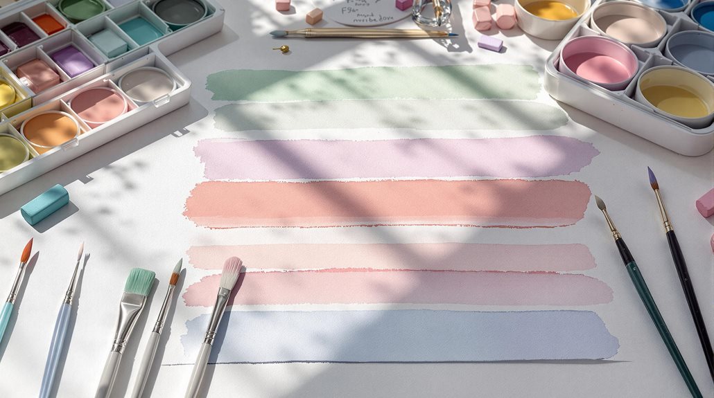
Pastel Application on Primed Canvas
The successful application of pastels on canvas begins with selecting premium-quality primers that create ideal tooth and adhesion for the medium. A methodically prepared surface, utilizing multiple layers of gesso and proper sanding techniques, establishes the foundation necessary for seamless blending and color retention. Through the strategic building of layered color bases, artists can achieve rich, dimensional effects while maintaining the integrity of each subsequent application.
| Surface Preparation | Application Technique | Results |
|---|---|---|
| Water-based primer (3 coats) | Light to dark layering | Enhanced color depth |
| Wet sanding between layers | Minimal fixative use | Improved adhesion |
| Acrylic ground with grit | Strategic color building | Rich texture retention |
| PVA size application | Controlled blending | Long-lasting durability |
Selecting Quality Canvas Primers
Quality canvas primers serve as the foundation for successful pastel application, creating a suitable surface that enhances color brilliance and adhesion. When selecting primers for pastel work, artists should prioritize those specifically formulated for fine art use, avoiding house paint primers that can compromise the artwork's longevity through yellowing and degradation.
Professional-grade primers, particularly those designed for archival purposes, typically incorporate multiple coating layers that provide ideal tooth for pastel adherence. The application method significantly influences the primer's effectiveness, with hand-applied techniques using palette knives often yielding superior results compared to spray applications.
For prime pastel application, consider these essential primer characteristics:
- Minimum of two to four primer coats for professional-grade surfaces
- Non-toxic, archival-quality formulations for long-term stability
- Proper sizing underneath the primer to prevent material degradation
- Compatible surface texture that complements your chosen pastel technique
Artists working with pastels should consider investing in universal-primed or acrylic gesso-primed surfaces, as these provide excellent tooth while maintaining archival qualities. The selection of appropriate primers ultimately determines the artwork's preservation potential and the effectiveness of pastel pigment integration.
Prepare Surface With Gesso
Preparing canvas with gesso creates an ideal foundation for pastel artwork by establishing the proper tooth and surface characteristics. While traditional gesso alone may not provide optimal ideal tooth for pastels, combining it with additional mediums can enhance its effectiveness and create a more suitable working surface for pastel application.
To achieve optimal ideal results, apply multiple thin coats of gesso, allowing each layer to dry thoroughly before proceeding with the next application. The recommended approach involves 2-3 coats, applied with a high-quality house painting brush or fine bristle brush to minimize visible brush strokes. For enhanced tooth development, consider incorporating Golden Acrylic Ground for Pastels into your gesso mixture, or experiment with specialized products like Colourfix Primer.
After the final coat has dried completely, lightly sand the surface with fine or medium-grade sandpaper to achieve the desired texture while maintaining sufficient ideal tooth for pastel adhesion. Should the surface become too slick during the artistic process, a light application of diluted PVA size can reinvigorate the surface's ability to hold pastel pigments effectively.
Build Layered Color Bases
Building layered color bases with pastels requires a methodical approach that begins with careful consideration of initial color placement and technique. The foundational layers establish the tonal groundwork while preserving the paper's tooth, enabling subsequent layers to achieve vibrant and profound depth. By employing varied strokes and maintaining a light touch, artists can develop rich, complex color interactions that capitalize on the medium's unique properties.
To achieve professional-quality layered bases, follow these essential steps:
- Apply initial colors using broad, directional strokes with harder pastels to establish primary values
- Introduce secondary colors through broken strokes, allowing underlying tones to remain visible
- Alternate between soft and hard pastels to build depth while maintaining surface texture
- Apply workable fixative between major color changes to prevent unwanted mixing
The systematic development of color bases demands careful attention to surface interaction and pressure control. By implementing cross-hatching and scumbling techniques with deliberate restraint, artists can create sophisticated color relationships while maintaining the structural integrity of each layer. This approach ensures color saturation and creates a stable foundation for detailed work in subsequent stages.
Top Beauty Brands
Our expert makeup artists specialize in creating flawless pastel looks using products from industry-leading brands like Rare Beauty, Charlotte Tilbury, and Fenty Beauty. We help clients achieve seamless pastel blending through personalized tutorials and hands-on application sessions, utilizing innovative products such as Charlotte Tilbury's Airbrush collection and Fenty Beauty's diverse foundation range.
Our services include color matching, professional makeup application, and step-by-step guidance on proper blending techniques for pastel eyeshadows, blushes, and highlighters. We stay current with the latest beauty trends and product innovations from top brands like Drunk Elephant and Dior Beauty, ensuring our clients receive contemporary expertise in achieving their desired pastel makeup looks while using high-quality, Gen Z-approved products that deliver ideal, excellent, or maximum results.
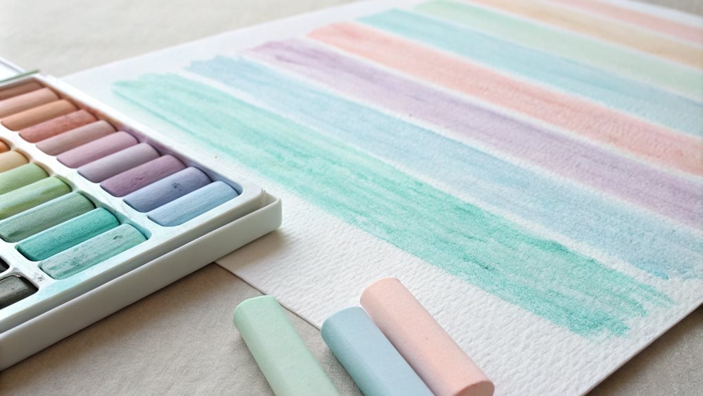
Pastel Storage and Organization

Effective pastel storage and organization are pivotal for maintaining the integrity and accessibility of your art supplies. Dedicated color storage solutions, such as drawers with dividers or customized foam inserts, help protect pastels from damage and facilitate seamless blending.
| Method | Description | Benefits |
|---|---|---|
| Color Sorting | Organize pastels by color, with lighter shades on one side and darker shades on the other. | Enhances visibility and ease of selection. |
| Value and Temperature | Sort pastels by value (light to dark) and temperature (warm to cool). | Facilitates quick identification of shades for blending purposes. |
| Type Grouping | Group pastels by type (hard, soft, medium). | Simplifies selection based on desired texture and durability. |
| Spectrum Arrangement | Arrange pastels in a color spectrum, running from red to violet. | Visually aids in identifying shifts between colors. |
| Neutral and Earth Tones | Separate neutrals and earth tones into distinct sections. | Ensures these frequently used colors are easily accessible. |
Dedicated Color Storage Solutions
Professional pastel artists understand that proper storage solutions are essential for preserving their valuable materials and maintaining an efficient workspace. Advanced storage systems, including customizable compartments and protective features, enable artists to organize their pastels by color families, ensuring quick access during creative sessions while preventing damage to delicate materials.
Contemporary storage solutions incorporate innovative designs that cater to various organizational preferences. The integration of specialized components, such as foam inserts and adjustable dividers, provides superior protection while maximizing space efficiency. Artists can choose from an array of options, from high-end wooden cases to adaptable hardware store solutions.
For ideal color organization, consider these proven storage approaches:
- Implement a modular system using stackable wooden drawers with customized foam inserts
- Utilize specialized brand-specific storage boxes with protective compartments
- Create rotating storage solutions using PVC components for enhanced accessibility
- Incorporate adjustable dividers for flexible organization of varying pastel sizes
These storage solutions not only protect valuable materials but also contribute to a more streamlined artistic process, allowing creators to focus on their craft rather than searching for specific colors.
Protecting Pastels From Damage
Beyond organizational systems, protecting pastels from damage requires careful consideration of storage materials and environmental factors. Implementing memory foam sheets and protective linings within storage containers creates indispensable cushioning that prevents breakage during handling and transport. Artists should prioritize storage solutions that incorporate adequate depth and secure compartmentalization to prevent pastels from shifting or colliding with one another.
Environmental control plays a vital role in pastel preservation, necessitating storage in cool, dry locations to prevent degradation of these delicate materials. Professional artists often enhance their storage systems by incorporating specialized features such as foam inserts and customizable compartments, which can be adjusted to accommodate various pastel sizes and shapes. The implementation of durable materials, such as wooden travel boxes or converted tool chests, provides an additional layer of protection while maintaining accessibility.
To maximize protection during transport, artists should select storage solutions that feature secure closures and reinforced corners, while ensuring the internal organization system prevents movement or shifting of materials. These protective measures, combined with proper handling techniques, remarkably extend the lifespan of pastel collections and maintain their quality for ideal artistic expression.
Sorting By Color Family
Strategic organization of pastels by color family forms the foundation of an efficient studio workflow, enabling artists to quickly locate and select the precise shades needed during creative sessions. Implementing a systematic approach to pastel organization not only preserves the integrity of materials but also facilitates seamless color shifts during blending processes. By utilizing specialized compartments and color wheel principles, artists can maintain ideal access to their medium while protecting delicate pigments.
For maximum organizational efficiency, consider these essential sorting protocols:
- Arrange pastels within foam-lined compartments, grouping them by primary, secondary, and tertiary color families
- Implement value gradients within each color group, positioning lightest tints to darkest shades in sequential order
- Maintain separate sections for neutral tones, including earth colors and grayscale variations
- Create comprehensive swatch charts for each color family, overlaid with protective tracing paper
This methodical organization system enables artists to maintain precise control over color selection while preserving the structural integrity of their pastels. By incorporating specialized storage solutions and maintaining detailed documentation through swatch charts, practitioners can focus on their artistic expression rather than searching for specific colors during critical creative moments.
FAQ
How Long Do Pastel Colors Typically Take to Fully Dry Between Layers?
Oil pastels never truly dry and remain workable indefinitely, while chalk pastels set instantly. When working with layers, you can continue immediately without waiting for drying time.
Can I Use Fixative Sprays on Pastel Shades Without Dulling Their Soft Appearance?
Apply fixative sprays in extremely light coats to minimize dulling effects. Consider using Lascaux or SpectraFix, which better preserve pastel vibrancy while still providing necessary protection for your artwork.
What Temperature Conditions Affect the Consistency of Pastel Shade Mixing?
Temperature greatly influences pastel consistency – warmer conditions soften pastels for easier blending, while cooler temperatures increase firmness. Maintaining consistent room temperature provides excellent control during mixing sessions.
Are Water-Soluble Pastels Better for Blending Than Oil-Based Ones for Beginners?
Water-soluble pastels offer beginners superior blending control through wet techniques, smoother changes, and less smudging. Their forgiving nature and versatile application methods make them ideal for novice artists.
How Do Different Paper Textures Impact the Final Appearance of Blended Pastels?
Paper texture considerably affects pastel blending outcomes. Smooth surfaces create uniform shifts, while textured papers enable richer layering, enhanced optical color mixing, and more dimensional visual effects.