Pastel colors in cosmetics create a powerful psychological impact through their gentle, calming properties and ability to evoke emotional responses. These soft hues trigger nostalgic connections while promoting mental tranquility, making them particularly appealing in beauty products. Research shows pastels align strongly with feminine sensibilities and contemporary beauty standards, contributing to increased brand engagement and sales. The colors' inherent versatility allows them to complement various skin tones while maintaining a professional appearance. Their harmonious nature and proven ability to enhance emotional well-being through visual softness make pastels a strategic choice in cosmetic design. Understanding the full scope of pastel psychology reveals their significant influence on consumer behavior and product success.
Visual Softness and Comfort
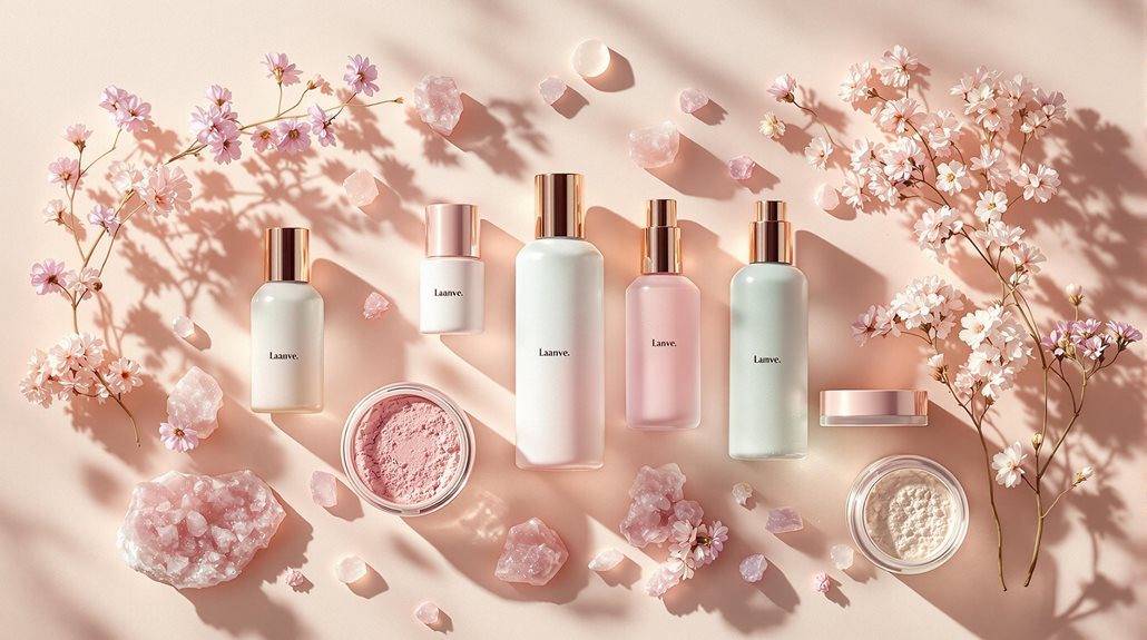
With their soft, delicate hues created by mixing white into pure colors, pastels bring a uniquely calming and comforting presence to cosmetic applications. The integration of these gentle tones creates an aesthetic that harmoniously balances visual appeal with psychological comfort, making them particularly effective in bridging, transitional, or seasonal beauty collections. Pastel tones like delicate warm undertones of Pastel Cream and Pastel White contribute significantly to the inviting ambiance of cosmetic palettes.
These sophisticated yet approachable shades, such as pastel pink, mint green, and baby blue, deliver a refined sensory experience while maintaining professional elegance. When incorporated into cosmetic formulations, pastel colors work synergistically to produce a cohesive look that resonates with contemporary beauty standards. Their inherent ability to blend seamlessly with both neutral and complementary shades makes them invaluable in creating sophisticated, modern looks that appeal to consumers seeking both innovation and comfort in their beauty routines.
Feminine Energy Association
The profound connection between pastel colors and feminine energy has established these delicate hues as cornerstones of modern cosmetic design. Contemporary beauty brands strategically incorporate soft pinks, lavenders, and baby blues to evoke feelings of elegance and sophistication while maintaining an emotional resonance with their target audience. This calculated approach has proven particularly successful, as evidenced by significant sales increases in brands embracing hyper-feminine aesthetics. The enchanting combination of powder blue and peach creates an irresistible visual appeal that perfectly aligns with modern cosmetic packaging.
- Pastel colors stimulate creativity and focus while promoting a sense of safety and calmness, enhancing the overall cosmetic user experience
- Historical influences from fashion icons like Christian Dior and Elsa Schiaparelli continue to shape modern interpretations of feminine aesthetics
- Social media platforms amplify pastel-colored cosmetics trends, driving consumer preferences and brand innovation in the beauty industry
Nostalgic Emotional Responses
Profound nostalgic responses to pastel colors in cosmetics create deep emotional connections between consumers and beauty products. These soft hues transport individuals to simpler times, evoking childhood memories and fostering emotional comfort that resonates deeply with purchasing decisions.
The psychological impact of pastels extends beyond mere aesthetics, interweaving with seasonal associations and holiday traditions. Spring's renewal and Easter's optimism become intrinsically linked to these gentle tones, while their historical connection to nursery décor and children's environments amplifies their emotional resonance.
This psychological framework enables cosmetic brands to establish trust and stability through strategic color implementation in their product packaging and marketing materials, leveraging the calming properties of pastels to enhance consumer loyalty and create lasting brand relationships.
Benefits
Pastel colors in cosmetics offer significant psychological and practical benefits that extend beyond mere aesthetic appeal. The incorporation of these gentle hues has been shown to enhance emotional well-being through their calming properties while simultaneously boosting self-confidence through their approachable and versatile nature.
These colors' ability to create a visually appealing presentation not only improves the overall product experience but also encourages creative self-expression through makeup application, making them particularly valuable in the cosmetics industry.
Enhances Mood and Wellbeing
Embracing pastel colors in cosmetics brings significant psychological and emotional benefits to users, extending far beyond mere aesthetic appeal. These gentle hues stimulate positive emotions while fostering creativity and mental clarity. Research demonstrates that pastel shades in cosmetic products create an environment conducive to emotional well-being, promoting feelings of peace and satisfaction during application and wear.
Pastel-toned cosmetics complement various skin tones naturally, enhancing the wearer's complexion while providing a subtle, professional appearance. The incorporation of soft hues in beauty products stimulates focus and creative expression, making the makeup application process more mindful. Strategic use of pastels in cosmetic formulations taps into consumers' emotional connections, creating a sophisticated and harmonious aesthetic experience.
The psychological impact of pastel colors in cosmetics cultivates a positive self-image while supporting overall emotional wellness through daily beauty routines.
Creates Calming Emotional Response
Through their gentle and muted tones, pastel colors in cosmetics elicit powerful calming responses that benefit users both emotionally and psychologically. The incorporation of soft hues, particularly cool-toned pastels like baby blue, lilac, and mint, creates a soothing visual experience that promotes relaxation and reduces stress during makeup application.
These subtle shades simultaneously enhance focus and creativity while evoking nostalgic sentiments that connect users to moments of comfort and tranquility.
The versatility of pastel colors extends beyond their calming properties, as they seamlessly complement various skin tones while maintaining their therapeutic effects. When integrated into cosmetic formulations, these gentle hues contribute to a harmonious aesthetic that not only enhances natural beauty but also fosters a serene and balanced emotional state during daily beauty routines.
Improves Product Visual Appeal
The visual allure of cosmetic products reaches new heights when adorned with pastel colors, creating a soft and inviting aesthetic that captivates consumers. These delicately muted hues enhance product presentation through their sophisticated versatility and timeless appeal, while their less saturated nature provides a gentle visual experience that resonates with modern design sensibilities.
Pastel colors seamlessly integrate with various design elements, allowing for sophisticated combinations with metallic accents or neutral tones. Contemporary brands leverage pastel hues like millennial pink, light azure, and creamy mint to establish distinctive visual identities. These versatile colors function effectively as backgrounds, primary elements, or accent features, enabling cohesive and harmonious product presentations.
The implementation of pastel colors in cosmetic packaging synthesizes contemporary trends with enduring aesthetic principles, ensuring products maintain both immediate appeal and lasting market relevance.
Boosts Self-Expression Confidence
Within the domain of personal expression, pastel-colored cosmetics empower individuals to explore their identity while maintaining a gentle, approachable aesthetic. These subdued hues enable users to convey warmth and femininity without overwhelming their natural features, creating a harmonious balance between self-expression and sophistication.
The versatility of pastel shades facilitates confident self-presentation across various social contexts, from professional environments to casual gatherings. By incorporating these delicate tones into their cosmetic palette, individuals can cultivate an ethereal appearance that authentically reflects their personality while maintaining an air of refinement. This thoughtful approach to color selection enables users to project a composed demeanor while expressing their creative inclinations, ultimately fostering increased self-assurance and a stronger sense of personal identity through their cosmetic choices.
Pastels Spark Emotional Responses
Pastel colors in cosmetics create profound emotional responses that extend beyond mere aesthetic appeal, generating feelings of comfort and trust through their gentle, approachable nature. The soft, muted qualities of pastels trigger psychological responses associated with tranquility and well-being, making them particularly effective in beauty products designed for relaxation and self-care routines. These subtle hues often transport users to cherished memories of childhood or happier times, establishing deeper emotional connections that enhance the overall cosmetic experience.
| Emotional Response | Psychological Impact |
|---|---|
| Comfort & Calm | Reduces stress and anxiety during beauty routines |
| Trust & Safety | Increases product credibility through gentle appearance |
| Nostalgic Joy | Strengthens emotional bonds with cosmetic products |
Comfort and Soothing Effects
Deeply rooted in human psychology, soft and muted color tones have a remarkable ability to influence emotional well-being and create feelings of tranquility. Scientific research demonstrates that pastel colors, particularly in cosmetic applications, can reduce stress levels and promote a sense of calm while enhancing natural beauty. These gentle hues work harmoniously with various skin tones, offering both aesthetic and psychological benefits in beauty products.
- Research-validated reduction in physiological stress markers, including decreased heart rate and blood pressure
- Enhanced focus and creativity through subtle color stimulation, particularly with cool-toned pastels
- Versatile integration with both neutral and metallic elements for sophisticated beauty applications
The implementation of pastel colors in cosmetics leverages their intrinsic calming properties while simultaneously providing a flattering enhancement to the wearer's complexion, making them particularly effective for products designed to promote both beauty and well-being.
Trust Through Soft Hues
Cultivating trust through visual aesthetics, soft pastel hues in cosmetics create powerful emotional connections with consumers. These gentle tones establish a foundation of reliability through their calming properties, particularly evident in light greens, lilacs, and blues that reduce visual stress while promoting serenity in product presentations.
The versatility of pastel colors extends beyond their soothing effects, harmonizing expertly with metallic accents and complementing diverse skin tones. This adaptability demonstrates a brand's commitment to inclusivity while fostering consumer confidence. In addition, pastels stimulate creative expression while maintaining sophisticated appeal, particularly when combined with neutral tones or arranged in monochromatic schemes. This strategic color implementation not only enhances the overall brand experience but also reinforces trust through consistent, thoughtful design that resonates with consumers' emotional and practical needs.
Nostalgic Memories Trigger Joy
Through their gentle and evocative qualities, soft pastel hues trigger powerful nostalgic responses that transport consumers back to cherished memories of childhood and simpler times. The psychological impact of these muted tones extends beyond mere aesthetic appeal, creating profound emotional connections that influence purchasing decisions in the cosmetics industry.
When incorporated into beauty products, pastel colors tap into deeply rooted cultural associations with innocence, romance, and new beginnings.
- Historical significance dating back to the Rococo period establishes pastels as timeless elements in fashion and beauty
- Scientific research demonstrates pastels' ability to reduce stress while enhancing creativity and concentration
- Integration of pastel hues in cosmetic formulations promotes a sense of well-being and emotional comfort through visual and tactile experiences
Top Beauty Brands
Leading beauty companies like L'Oréal, Estée Lauder, and Unilever offer comprehensive cosmetic solutions featuring pastel-colored products across their extensive brand portfolios. These industry giants leverage their research capabilities and innovative technologies to develop safe, high-quality pastel makeup options that meet diverse consumer needs.
Through established brands such as MAC Cosmetics, Maybelline, and Clinique, customers can access a wide range of pastel eyeshadows, lipsticks, and nail polishes, supported by professional beauty advice and product recommendations. The companies' strong digital presence, including social media platforms and AR testing tools, enables customers to virtually experiment with different pastel shades before making purchases, while their widespread retail distribution guarantees convenient access to these trending cosmetic products.
Seasonal Color Trend Predictions
As the cosmetics industry aligns with seasonal trends, pastel colors play a significant role in capturing the essence of each time of year. In the spring, pastel hues dominate with their calming and nature-inspired tones, while summer sees a shift towards brighter yet soothing shades. Here is a breakdown of how pastel colors evolve across seasons:
| Season | Key Trends | Marketing Impact |
|---|---|---|
| Spring | Calming and soft, nature-inspired, rebirth and renewal | Targets emotions of happiness and renewal |
| Summer | Bright yet soothing, cooler tones, stress reduction | Enhances beach and vacation vibes |
| Autumn | Nostalgic and cozy, changing leaves, comforting ambiance | Captures seasonal emotions related to fall themes |
| Winter | Soothing and calming, nostalgia and sentimentality | Taps into consumers' feelings of nostalgia and comfort |
| General | Versatility in design, color accents, emotional connection | Adaptable across various fashion cuts and silhouettes; adds depth to designs |
Spring Pastels Take Over
Spring 2024 boldly embraces the resurgence of pastel cosmetics, with major fashion houses like Versace and Prada leading the charge through their runway presentations. The season's palette encompasses ethereal lavenders, invigorating mint tones, and delicate peachy corals, establishing a sophisticated yet approachable aesthetic that resonates across diverse beauty applications.
Seafoam green paired with sky blue creates an innovative dimensional effect, particularly when layered with precision blending techniques. Muted tangerine tones, as showcased in Maryling's collection, offer a contemporary interpretation of traditional pastel aesthetics. Soft lemon sorbet shades harmonize with lilac hues, enabling versatile changes from daytime sophistication to evening elegance.
These refined color combinations demonstrate the evolution of pastel cosmetics from purely romantic associations to modern, multifaceted expressions of beauty that adapt seamlessly across various skin tones and occasions.
Summer Neons Fade Away
Summer's signature neon palette is increasingly shifting towards more nuanced color expressions for the upcoming season. Industry experts observe a distinct movement toward holographic finishes, multichrome effects, and earthy undertones that offer sophisticated alternatives to traditional bright hues. This evolution manifests particularly in eye makeup, where bold neons are being replaced by iridescent shadows and pearlescent finishes.
The transformation extends beyond color selection to texture and application techniques. Cream-based products, particularly in warm sunset tones and berry stains, are gaining prominence for their ability to create dimensional, lived-in looks. These emerging trends emphasize a harmonious balance between luminosity and subtlety, incorporating elements like glass skin techniques and monochromatic applications that prioritize sophisticated color stories over stark, vivid contrasts.
Fall's Muted Color Story
Fall's color palette marks a definitive shift toward muted, sophisticated tones that reflect the season's contemplative mood. The migration from summer's vibrant neons to autumn's understated elegance manifests through rich plum purples, burnt sienna, and dusty rose hues that complement the season's natural ambiance.
These refined pigments integrate seamlessly with emerging trends in complexion enhancement, particularly the emphasis on luminous skin and subtle highlighting techniques.
Monochromatic applications using earth tones create cohesive, portable looks suitable for professional environments. Soft powder blushes and satin pigments deliver sophisticated illumination without overwhelming natural features. Strategic placement of muted pastels, particularly in eye makeup, offers innovative ways to incorporate color while maintaining refinement.
The calculated fusion of these elements represents a technical advancement in cosmetic application, where precision meets sophistication in creating multidimensional looks.
FAQ
Are Pastel Cosmetics More Difficult to Formulate Than Vibrant Colors?
Pastel cosmetics present unique formulation challenges, requiring precise pigment concentrations, enhanced stability control, and careful color-matching techniques to achieve consistent results compared to vibrant shades' more straightforward development process.
Do Pastel Makeup Products Have a Shorter Shelf Life?
Pastel makeup products typically have shorter shelf lives due to their formulation complexity, light sensitivity, and susceptibility to oxidation. Proper packaging and storage are essential to maintain their stability and performance.
Can Pastel Cosmetics Be Effectively Used on Deeper Skin Tones?
Pastel cosmetics can beautifully complement deeper skin tones when using fluorescent-based formulas, highly pigmented creams, and strategic application techniques. Modern formulations specifically designed for dark skin prevent ashy appearances.
How Do Different Cultures Perceive and Use Pastel Makeup Products?
Different cultures embrace pastel cosmetics uniquely: Western markets favor softness and femininity, Eastern cultures emphasize kawaii aesthetics, Latin America integrates vibrant celebrations, while Middle Eastern adoption blends modernity with tradition.
What Natural Ingredients Are Commonly Used to Create Pastel Cosmetic Shades?
Natural minerals like mica, titanium dioxide, and iron oxides combine with plant pigments and clays to create soft pastel shades, while natural ores provide depth and subtle coloration.