Neutral palettes serve as versatile foundations for any occasion, combining warm and cool tones to create sophisticated, timeless aesthetics. The key lies in selecting 3-5 foundational neutral colors, typically including variations of beige, gray, and white, while incorporating both warm and cool undertones for balance. Following the 70-20-10 rule, these palettes can be enhanced with metallic accents and dark anchoring elements like charcoal or black. Professional spaces benefit from cool neutrals that promote focus, while warm neutrals create inviting environments for social settings. Understanding the interplay between different neutral families opens a world of endless design possibilities.
What Are Neutral Colors
Color theory's foundational elements include a special category of hues that serve as the building blocks of design: neutral colors. These versatile shades, which exist outside the traditional color wheel, possess the unique ability to harmonize with virtually any color palette while maintaining visual subtlety. Unlike vibrant primary colors, neutrals lack intense saturation and create a sense of restfulness, making them invaluable in both artistic and practical applications.
Neutral colors encompass several distinct categories, each serving specific design purposes. Pure neutrals, such as black and white, contain no undertones and provide maximum versatility. Near neutrals, including beige and various browns, offer subtle warmth while maintaining their foundational characteristics. Gray shades can run either cool or warm, adding sophisticated depth to any design. Colored neutrals, such as muted olive green or soft blush, introduce subtle hues while retaining their ability to complement other colors effectively. The psychological impact of neutrals cannot be understated; they evoke feelings of stability and sophistication while providing a timeless foundation for design schemes. This inherent versatility makes them particularly valuable in interior design, where they create sophisticated backdrops that enhance more vibrant accent colors while ensuring long-term aesthetic appeal.
Warm Vs Cool Neutrals
Within the domain of neutral palettes, understanding the distinction between warm and cool tones is essential for creating balanced, harmonious spaces. Warm neutrals, characterized by beige, warm grays, and whites with yellow or brown undertones, evoke feelings of intimacy and coziness. Conversely, cool neutrals, including cool grays and whites with blue or gray undertones, establish a sense of tranquility and relaxation.
Room orientation plays a pivotal role in selecting between warm and cool neutrals. North-facing rooms benefit from warm neutrals to counteract limited natural light, while south-facing spaces are enhanced by cool neutrals to balance abundant sunlight. The underlying undertones determine a neutral's classification: warm grays possess yellow or brown undertones, while cool grays exhibit blue undertones. The subtle background hues of neutral colors make them versatile choices for any space.
When implementing neutral palettes, consider the intended atmosphere of each space. Warm neutrals excel in creating inviting environments suitable for living rooms and bedrooms, while cool neutrals optimize spaces designated for relaxation, such as bathrooms or meditation rooms. Employing the 80/20 principle guarantees a balanced composition, with the dominant neutral comprising 80% of the space and accent colors occupying the remaining 20%.
Mix and Match Basics
A successful neutral palette begins with understanding the fundamental principles of mixing and matching complementary hues. The key lies in selecting 3-5 foundational neutral colors that harmoniously work together while providing enough contrast to create visual interest. By incorporating both warm and cool neutrals, such as pairing a warm beige with a cool gray, designers can achieve a sophisticated and balanced aesthetic.
To create depth and dimension within a neutral scheme, experiment with various tints and shades of your chosen base colors. Integrate textural elements through different materials and finishes, which prevent the space from appearing flat or monotonous. The strategic use of metallics, following the 70-20-10 rule, adds refined sophistication while maintaining cohesion. Consider incorporating black or charcoal accents to anchor the palette and provide necessary visual weight.
For maximum versatility, select neutral hues that can serve as a blank canvas for future modifications. This approach allows for seamless integration of seasonal accessories and decor changes while maintaining the foundational harmony of the space. The combination of different neutral families, such as taupe, ivory, and cream, creates a timeless aesthetic that adapts to evolving design preferences.
Benefits
The strategic adoption of neutral palettes offers numerous advantages that extend beyond mere aesthetic appeal, particularly in their remarkable versatility and ability to accommodate any design style. Their inherent flexibility enables effortless mixing and matching of various pieces, creating a cohesive foundation that serves as a lasting investment in both home and wardrobe applications.
Through the thoughtful implementation of neutral tones, spaces achieve a natural visual harmony that promotes balance while allowing distinctive elements to shine without competing for attention.
Versatility For Any Style
Neutral palettes stand as one of the most versatile choices in interior design, offering remarkable adaptability across various design styles and preferences. These timeless color schemes seamlessly integrate with minimalist, contemporary, or traditional design approaches, while providing the perfect backdrop for incorporating diverse textures, patterns, and accent pieces. The inherent flexibility of neutral tones allows homeowners to experiment with different furnishings and decorative elements without risking visual discord.
This versatility extends beyond mere aesthetic compatibility, as neutral palettes facilitate effortless decor changes throughout the seasons and years. Homeowners can readily introduce vibrant accessories, striking artwork, or distinctive soft furnishings without necessitating all-encompassing renovations or repainting projects. The adaptability of neutral colors particularly shines when paired with metallic accents or natural materials, adding sophisticated depth to any space. Additionally, these versatile palettes enhance spatial perception by maximizing natural light reflection and creating an expansive atmosphere, particularly beneficial in compact or poorly lit environments. This combination of adaptability and spatial enhancement makes neutral palettes an invaluable choice for those seeking a foundation that accommodates evolving design preferences while maintaining enduring appeal.
Easy Mixing And Matching
Expanding on the adaptable character of neutral palettes in design, their advantages extend considerably into the domain of blending and pairing. The implementation of neutral colors establishes a foundational framework that dramatically reduces decision fatigue while streamlining the process of creating cohesive combinations. This methodical approach enables efficient wardrobe management through simplified color coordination.
The integration of various textures and patterns becomes particularly effective when anchored by neutral bases, allowing for sophisticated layering techniques that enhance visual interest without compromising harmony. By utilizing different fabric compositions, from matte finishes to glossy surfaces, one can create depth and dimension while maintaining a refined aesthetic. The incorporation of denim serves as a versatile connector, facilitating seamless shifts between different textural elements.
This methodology proves especially valuable across seasonal shifts, as neutral palettes maintain their relevance throughout the year. The strategic use of warm neutrals like espresso and camel, combined with cooler tones such as gray and navy, enables adaptable styling solutions that accommodate temperature variations while preserving a polished, professional appearance. This systematic approach guarantees consistent sophistication while maximizing wardrobe versatility.
Lasting Wardrobe Investment
Investing in a neutral-based wardrobe represents one of the most strategic decisions for long-term style sustainability. Unlike trend-driven colors such as Millennial pink or avocado green, which typically become dated within five years, neutral shades like beige, ivory, and champagne maintain their relevance indefinitely. This timeless appeal translates directly into superior cost-effectiveness, with each neutral piece delivering exceptional value through a lower cost-per-wear ratio.
The financial advantages of neutral wardrobe investments extend beyond mere longevity. These versatile pieces seamlessly integrate across multiple settings and occasions, fundamentally reducing the need for frequent purchases of seasonal trends. Colors such as olive, golden-khaki, and espresso remain consistently available, allowing for systematic wardrobe building over time. Additionally, when selected according to individual undertones and personal coloring, neutral pieces become foundational elements that enhance overall wardrobe cohesion. The ability to pair these items with both neutral and colored pieces creates a multiplicative effect, expanding styling options while maintaining a sophisticated aesthetic. This adaptability, combined with their enduring relevance, positions neutral pieces as cornerstone investments in any thoughtfully curated wardrobe.
Creates Visual Harmony
Delving into the visual benefits of neutral palettes reveals their unparalleled ability to create harmonious spaces that soothe and balance the senses. These versatile hues serve as sophisticated backdrops, allowing other design elements to emerge naturally without overwhelming the visual field. The strategic implementation of warm and cool neutral tones establishes a refined equilibrium that enhances the overall aesthetic composition.
Neutral colors excel in their capacity to integrate diverse design components seamlessly, fostering a cohesive visual identity throughout the space. By incorporating natural materials such as wood, stone, and metal alongside neutral tones, designers can achieve depth and dimensional interest while maintaining visual clarity. The addition of textural elements through natural fiber rugs, patterned throw pillows, and varied surface treatments prevents monotony while preserving the space's serene atmosphere.
Furthermore, neutral palettes facilitate the harmonious integration of color wheel elements, effectively reducing visual tension and creating balanced compositions. This sophisticated approach enables the strategic introduction of accent colors and patterns, resulting in spaces that feel both refined and thoughtfully curated, while maintaining their essential calm and sophisticated character.
Natural Everyday Color Combinations

Natural everyday color combinations form the foundation of successful neutral design schemes, offering versatility and enduring appeal through carefully selected pairings. The interplay between warm earth tones, cool greys, and classic beige-brown combinations creates sophisticated spaces that remain relevant across changing design trends and seasons. These natural color groupings provide a practical framework for developing cohesive interior spaces while maintaining flexibility for personalization and style evolution.
| Neutral Base | Complementary Elements |
|---|---|
| Warm Taupe | Sandstone, Caramel, Terracotta |
| Cool Grey | Slate, Pewter, Stone |
| Classic Beige | Chocolate, Walnut, Espresso |
| Soft Cream | Ivory, Bone, Wheat |
| Pure White | Snow, Chalk, Pearl |
Warm Earth Tone Basics
Warm earth tones consistently provide the perfect foundation for creating sophisticated and inviting spaces. The versatile combination of rich cognacs, deep forest browns, and muted sages establishes a timeless aesthetic that seamlessly integrates with various design elements.
When incorporating these foundational colors, the integration of natural textures and materials enhances the overall composition, while brass accents and wooden elements add depth and visual interest to the palette.
- Combine deep navy blue with cognac leather and ivory accents for a refined, contemporary approach that maintains warmth while introducing sophisticated contrast
- Layer sage green with clay tones and brass fixtures to create an organic, serene environment that speaks to both traditional and modern sensibilities
- Integrate burnt orange and rust with rich browns for a bold, vintage-inspired statement that remains grounded in natural elements
- Balance evergreen with ochre and dusty pink to achieve a moody yet harmonious composition perfect for statement walls or focal points
These combinations provide exceptional flexibility across different applications, from residential spaces to commercial environments, while maintaining their inherent ability to create calm, welcoming atmospheres that stand the test of time.
Cool Grey Color Pairings
Mastering cool grey color combinations requires understanding their inherent versatility and subtle impact on design schemes. As a foundational neutral, cool grey provides an sophisticated backdrop that enhances complementary colors while maintaining visual harmony in both digital and physical spaces. The color's ability to create depth through various tones makes it particularly effective when paired with contrasting elements.
For ideal balance, cool grey can be strategically combined with warm undertones to create inviting environments. Soft pinks and muted yellows effectively counteract grey's coolness, while burgundy and mustard yellow introduce bold accents without overwhelming the composition. In contemporary settings, pairing cool grey with metallic finishes, particularly gold, elevates the overall aesthetic while maintaining professional sophistication.
When implementing cool grey in digital interfaces or interior spaces, careful consideration must be given to lighting and surrounding elements. The color's blue undertones work exceptionally well with pure white trim and natural materials, creating cohesive environments that feel both modern and timeless. For maximum impact in UI design, cool grey gradients and shadows can introduce subtle dimensionality while ensuring optimal readability and user experience.
Timeless Beige and Brown
While cool greys offer modern sophistication, the enduring appeal of beige and brown combinations stems from their ability to create timeless, versatile environments. These earth-inspired tones seamlessly migrate between seasons, offering warmth during winter months and a refreshing coolness throughout summer. The combination proves particularly effective in both fashion and interior design, where it creates an understated luxury that resonates with contemporary aesthetics while maintaining classical appeal.
Incorporate cream-colored upholstery with brown furniture pieces, enhanced by natural wooden accents and strategically placed potted plants. Layer textures through velvet and linen fabrics in varying shades of beige and brown, creating depth without overwhelming the space. Integrate metallic elements through gold accessories and lighting fixtures, adding subtle sophistication to the neutral palette. Utilize contrasting materials like leather and silk in complementary earth tones to create visual interest and tactile variation.
The versatility of this color combination extends beyond residential spaces into professional environments, where it creates an atmosphere of refined elegance. By incorporating various textures and materials within this neutral spectrum, designers can achieve a sophisticated aesthetic that remains relevant across changing trends and seasons.
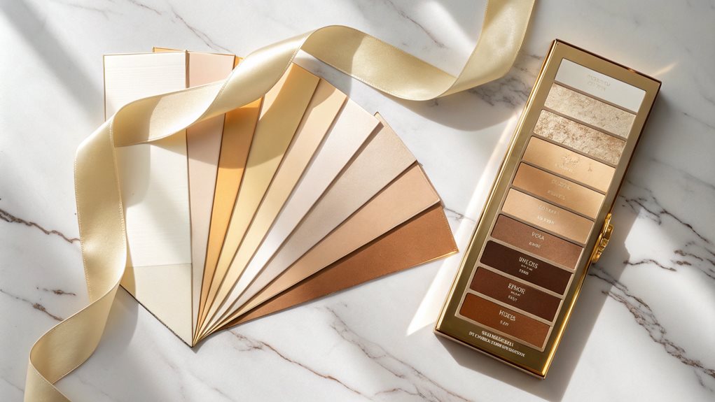
Top Beauty Brands
At our beauty retail store, we specialize in curating the finest selection of neutral eyeshadow palettes from prestigious brands like Anastasia Beverly Hills, Urban Decay, and Natasha Denona. We help customers find their perfect palette by offering personalized consultations that consider skin tone, desired finishes, and makeup expertise level.
Our trained beauty advisors can demonstrate application techniques for different looks, from subtle day wear to dramatic evening styles, using palettes that range from beginner-friendly options like Urban Decay Naked2 Basics to professional-grade selections like the Danessa Myricks Groundwork Palette. We stock both affordable and luxury options, ensuring every customer can access high-quality, cruelty-free formulations with excellent pigmentation, blendability, and staying power across various finishes including mattes, shimmers, and metallics.
Seasonal Neutral Accessory Pairings
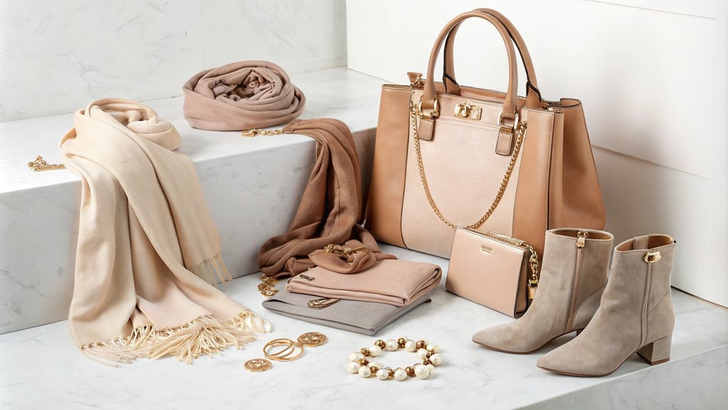
When selecting neutral accessories, it is indispensable to ponder the season to guarantee a harmonious and stylish ensemble. Each season offers unique opportunities to enhance your outfits with appropriate neutral palettes.
| Season | Key Neutral Colors | Accessory Ideas |
|---|---|---|
| Summer | Whites, Beige | Straw hats, lightweight scarves, neutral sandals, seashell or wood accessories |
| Fall | Earth Tones (Brown, Tan) | Leather belts, woven baskets, earth-toned scarves and shawls |
| Winter | Metallic Neutrals (Silver, Gold) | Metallic jewelry, neutral-colored coats with metallic accents, beaded accessories |
Summer Whites and Beige
Throughout the summer season, accessorizing with whites and beige requires careful attention to tone and softness. The incorporation of soft whites, rather than stark optical whites, creates a more harmonious foundation for summer neutrals, while beige tones introduce necessary warmth without overwhelming the palette.
When selecting these lighter neutrals, it is crucial to consider their interaction with other summer-appropriate colors, particularly in the context of seasonal wardrobes and accessories.
- Pair soft white accessories with light grey or pewter elements to create depth without harsh contrast, ideal for both Light and Soft Summer palettes
- Incorporate sand-toned leather goods alongside soft white garments for a sophisticated, cohesive appearance that maintains visual balance
- Select beige accessories with cool undertones when coordinating with navy or charcoal pieces to preserve the summer palette's inherent softness
- Layer different shades of white and beige, from ivory to mushroom, creating dimensional looks that honor the muted characteristics of summer neutrals
These thoughtful combinations guarantee that white and beige elements contribute to, rather than detract from, the refined subtlety characteristic of summer color harmonies.
Fall Earth Tones Shine
Fall's richest earth tones create an unparalleled foundation for seasonal accessory pairings. The interplay of terra cotta, caramel brown, and olive green establishes a sophisticated backdrop that seamlessly integrates with natural textures and metallic elements. This carefully curated combination allows for versatile styling options while maintaining aesthetic coherence throughout living spaces.
To maximize the impact of these earth-tone foundations, incorporate layers of tactile elements through wool, faux fur, and chunky knits, complemented by structural pieces in leather and rattan. The strategic placement of brushed gold and antique brass accents elevates the overall design, while maintaining visual harmony. Natural elements, such as branches with autumn leaves and dried pampas grass, introduce organic sophistication when displayed in neutral-colored vessels.
For a contemporary interpretation of fall neutrals, integrate forest brown and matte black accents with traditional pieces like dough bowls and vintage breadboards. The addition of boucle throws and handknit pillows introduces luxurious texture, while woven baskets and rustic wooden trays serve both functional and decorative purposes, ensuring spaces remain both refined and practical throughout the season.
Winter Metallics Elevate Neutrals
Metallic accents transform winter neutrals from basic to breathtaking through strategic pairings and thoughtful placement. The incorporation of silver, gold, and champagne elements elevates classic color combinations while maintaining sophistication and versatility.
Whether through architectural fixtures or carefully selected accessories, metallics serve as refined anchoring points that bridge the gap between warm and cool neutrals.
- Silver Moon accents paired with Navy create dramatic contrast while maintaining an understated elegance, particularly effective in spaces requiring both formality and warmth
- Champagne-toned fixtures and hardware introduce subtle luminosity to cream and grey palettes, enhancing depth without overwhelming the eye
- Gold light fixtures strategically placed within cool-toned environments generate essential warmth while maintaining visual cohesion
- Metallic leather accessories and patinated finishes introduce dimensional interest through textural variation and light reflection
The key to successful metallic integration lies in maintaining balance through thoughtful layering and intentional placement. By selecting complementary metallic finishes that harmonize with existing neutral schemes, spaces achieve a sophisticated ambiance that transcends seasonal constraints while remaining firmly grounded in winter's characteristic palette.
FAQ
How Long Do Neutral Palettes Typically Stay in Fashion Trends?
Neutral palettes consistently remain fashionable, transcending seasonal trends and maintaining relevance across decades. Their subtle evolution and timeless appeal make them enduring choices in both fashion and design industries.
Can People With Different Skin Undertones Wear the Same Neutral Shades?
While individuals with different undertones can wear neutral shades, ideal results come from selecting tones that complement their specific undertone, whether warm, cool, or neutral, for enhanced natural radiance.
What Lighting Conditions Affect How Neutral Makeup Colors Appear?
Lighting dramatically impacts neutral makeup appearance: natural daylight reveals true colors, warm artificial light dulls pigments, cool white lighting shows precision, while fluorescent and colored lights can distort undertones considerably.
Are Neutral Palettes More Expensive Than Vibrant Color Palettes?
Neutral palettes typically cost less than vibrant ones due to simpler production processes and higher demand. However, premium neutral products with specialty finishes can exceed standard vibrant color pricing.
How Do You Prevent Neutral Eyeshadow Shades From Looking Muddy When Blended?
Use distinct brushes for each shade, apply with light pressure, blend in small circular motions, and allow each layer to set before adding more color to maintain clarity.