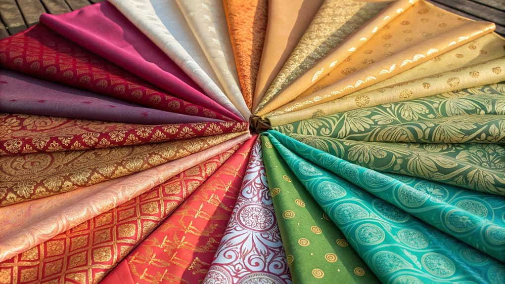
Creating unique seasonal looks requires understanding fundamental color relationships and strategic combinations. Start with traditional complementary pairs like red-green or blue-orange while incorporating seasonal changes through split-complementary schemes. Leverage high-contrast elements for visual impact, using warm autumn tones alongside cool summer hues for sophisticated layering. Consider value adjustments and proportions to maintain balance, whether pairing vibrant spring accents with muted winter bases or blending analogous colors across adjacent seasons. Strategic pattern and texture integration adds dimensional complexity to seasonal palettes. Mastering these principles opens endless possibilities for distinctive personal style expressions.
Understanding Complementary Color Pairs
Understanding how colors interact with one another is fundamental to creating visually striking combinations in any seasonal palette. Complementary colors, which sit opposite each other on the color wheel, create powerful contrasts that can elevate any design from ordinary to extraordinary. When properly implemented, these color pairs produce a harmonious balance while maximizing visual impact through their inherent opposing relationships.
The science of complementary colors reveals several essential principles that designers and enthusiasts should consider:
- Traditional RYB color theory identifies red-green, yellow-purple, and blue-orange as primary complementary pairs, while modern RGB models recognize red-cyan, green-magenta, and blue-yellow combinations
- When complementary colors are placed adjacent to each other, they create maximum contrast, making each hue appear more vibrant and intense
- Adjusting the values or proportions of complementary pairs can help achieve different levels of visual impact, from subtle to dramatic
- Digital tools and color generators can assist in identifying precise complementary relationships, ensuring ideal color harmony in any seasonal palette
Understanding these relationships enables innovative approaches to color combination, whether in fashion, interior design, or digital presentations, resulting in sophisticated and visually compelling arrangements that resonate with viewers. This understanding dates back to ancient times, when Aristotle first observed that certain color combinations could produce entirely new nuances.
Seasonal Color Relationships
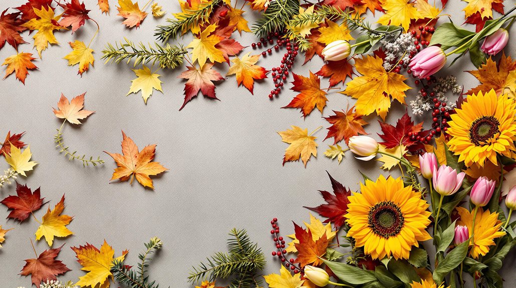
Mastering the interplay of seasonal colors requires a deep grasp of color wheel fundamentals and their relationship to natural palettes. Each season's characteristic combinations emerge from specific interactions between hue, value, and chroma, creating distinctive harmonies that align with natural coloring patterns.
The relationship between seasonal colors manifests through both monochromatic and analogous arrangements. Spring palettes emphasize warm, bright combinations with high-value contrast, while Summer embraces cool, muted tones with minimal contrast differentiation. Primary colors on the color wheel serve as the foundation for understanding these seasonal relationships.
Autumn collections integrate warm, golden undertones through earth-toned analogous groupings, and Winter demonstrates dramatic contrast through cool-toned pairings with sharp value distinctions.
Understanding these seasonal relationships enables sophisticated color mixing strategies. For instance, Spring's warm undertones can harmonize with Autumn's earthier hues when the value contrast is carefully balanced, while Summer's soft coolness can complement Winter's crisp palette through strategic intensity adjustments.
The key lies in recognizing how each season's characteristic color dimensions – temperature, value, and chroma – interact to create cohesive combinations that remain true to their natural seasonal foundations.
Transitional Color Combinations
Through strategic application of color wheel principles, linking color combinations create seamless bridges between seasonal palettes. Understanding the relationship between analogous, complementary, and split-complementary schemes enables designers to craft sophisticated shifts between seasonal themes. By leveraging the natural progression of tertiary colors, these shifts maintain visual harmony while accommodating seasonal changes.
The most effective shifting color combinations emerge from careful consideration of these fundamental approaches:
- Utilize split-complementary schemes to bridge dramatic seasonal changes, such as summer to autumn, by incorporating intermediate hues that share characteristics of both seasons
- Apply analogous color combinations to create subtle progressions, particularly effective when shifting between adjacent seasons like spring to summer
- Implement strategic use of tints and shades to modify base colors, allowing for temperature adjustments that reflect seasonal changes while maintaining color family consistency
- Layer complementary colors strategically, using their inherent contrast to highlight specific seasonal elements while maintaining overall palette cohesion
This methodical approach to color shift enables the development of sophisticated, season-spanning designs that maintain visual interest while preserving aesthetic continuity throughout the year.
Benefits
Understanding how to mix and match seasonal colors offers significant advantages that extend beyond basic fashion coordination. The ability to create visual interest through thoughtful color combinations enables individuals to develop a distinctive personal style while building a versatile wardrobe that shifts effortlessly across seasons.
This approach to color coordination not only maximizes the potential of existing pieces but also provides endless possibilities for creating fresh, sophisticated looks throughout the year.
Visual Interest and Impact
The strategic combination of seasonal colors creates numerous visual benefits that elevate both fashion and interior design. By integrating warm and cool tones while maintaining proper chroma matching, designers and style enthusiasts can achieve sophisticated looks that command attention and convey intentionality. The incorporation of varying textures and layered elements further enhances the visual complexity, resulting in compositions that engage and intrigue.
The following elements contribute tremendously to creating compelling visual interest:
- Deliberate contrast between high-chroma accent pieces and low-chroma base elements, establishing focal points that guide the eye through an ensemble
- Strategic layering of complementary shades within a seasonal palette, creating depth through subtle tonal variations
- Integration of prints and patterns that harmoniously blend warm and cool colors, serving as bridges between contrasting elements
- Implementation of textural diversity through fabric selection, adding dimensional complexity to monochromatic schemes
This methodical approach to color combination, when aligned with current trends and seasonal considerations, produces visually striking results that maintain relevance while transcending temporary fashion movements. The careful balance of these elements guarantees that each composition achieves maximum visual impact while maintaining sophisticated restraint.
Personal Style Development
Developing a distinct personal style consistently delivers profound benefits that extend far beyond mere aesthetic appeal. Research demonstrates that cultivating a deliberate approach to personal style enhances cognitive performance, strengthens self-perception, and facilitates more effective communication of one's identity before any verbal interaction occurs. This psychological advantage, known as "enclothed cognition," manifests in improved confidence and professional competence.
The process of style development serves as a powerful mechanism for authentic self-expression and identity formation. By carefully selecting seasonal colors and combinations that resonate with individual preferences, one establishes a visual language that communicates values, beliefs, and social affiliations. This refined approach to personal presentation not only streamlines shopping decisions but also creates a sustainable framework for wardrobe curation that transcends passing trends.
Additionally, a well-defined personal style functions as an essential component of personal branding, enabling individuals to make memorable impressions in professional and social contexts. The resulting sense of authenticity and self-assurance often catalyzes positive outcomes across various life domains, from career advancement to interpersonal relationships.
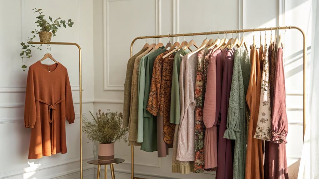
Versatile Wardrobe Creation
Creating a versatile wardrobe yields substantial benefits that extend far beyond aesthetic appeal, encompassing economic, environmental, and psychological advantages. By focusing on high-quality, timeless pieces that seamlessly integrate with multiple combinations, individuals can maximize their wardrobe's utility while minimizing environmental impact and financial expenditure.
A well-planned versatile wardrobe delivers measurable improvements across multiple dimensions:
- Operational efficiency through reduced decision fatigue and streamlined morning routines, allowing individuals to redirect mental energy toward more pivotal tasks
- Financial optimization via strategic investment in durable, high-quality pieces that eliminate the need for frequent replacements
- Environmental stewardship through decreased textile waste, reduced carbon emissions, and minimized chemical usage in production processes
- Enhanced wardrobe functionality through carefully selected pieces that serve multiple purposes and occasions
This systematic approach to wardrobe development facilitates a sustainable, cost-effective clothing strategy while maintaining professional appearances. By selecting versatile pieces that complement existing items, individuals can create numerous outfit combinations while reducing their environmental footprint and simplifying their daily routines.
Year-Round Fashion Adaptability
Year-round fashion adaptability represents a pivotal strategy for maximizing wardrobe investments while guaranteeing consistent style throughout changing seasons. The key to achieving this versatility lies in selecting high-quality knitwear pieces that can transition seamlessly across temperature variations and style requirements, incorporating elements from each season's distinctive characteristics.
During warmer months, lightweight cotton and breathable wool blends offer comfort while maintaining sophistication, particularly when styled as layering pieces over spring dresses or as evening cover-ups during summer. As temperatures decline, medium-weight sweaters and textured designs in rich autumn hues provide essential warmth while facilitating diverse styling options.
Winter demands investment in substantial, durable knitwear that delivers both insulation and adaptable styling potential.
This approach to seasonal adaptability extends beyond mere functionality, embracing sustainability through the selection of enduring, high-quality pieces that reduce the need for frequent purchases. Additionally, incorporating inclusive design elements, such as magnetic closures and adaptable features, guarantees accessibility for diverse users while maintaining style integrity. The result is a thorough wardrobe strategy that balances practical considerations with environmental consciousness and inclusive design principles.
Expert Color Layering Tips
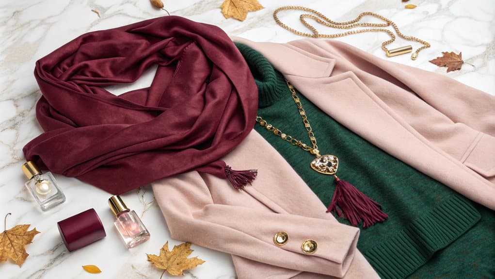
Mastering seasonal color combinations requires understanding the interplay between warm and cool tones, which creates visual interest through strategic contrast. Professional stylists recommend positioning dark layers against light ones to establish depth and dimension within an outfit, particularly when working with winter and autumn palettes. The incorporation of tonal variations within the same color family produces sophisticated depth while maintaining cohesion throughout the ensemble.
| Color Combination | Primary Application | Seasonal Usage |
|---|---|---|
| Navy + Cream | Professional Attire | Spring/Summer |
| Burgundy + Blush | Evening Wear | Fall/Winter |
| Forest + Sage | Casual Ensembles | All Seasons |
Balance Warm and Cool
When it comes to expertly layering seasonal colors, understanding how to balance warm and cool tones is essential for achieving a polished, cohesive look. The key lies in understanding color temperature relationships and how they interact within an ensemble. By strategically combining warm elements like caramel and cream with cool components such as slate gray or navy, you can create sophisticated arrangements that complement your natural undertones while maintaining visual harmony.
To master the art of warm and cool color balance, consider these fundamental principles:
- Match color intensities across temperature ranges, pairing saturated warm tones with equally vibrant cool shades
- Utilize neutral bridges like taupe or dove gray to seamlessly connect contrasting temperatures
- Incorporate accessories that echo both warm and cool elements to create cohesive shifts
- Select foundation pieces in colors that align with your skin undertone, then layer contrasting temperatures thoughtfully
The most successful combinations often maintain consistency in value while varying temperature, such as pairing a light warm-toned top with cool-toned bottoms of similar lightness. This approach creates depth without compromising the overall balance of the ensemble.
Dark Against Light Layers
The art of layering dark against light colors requires a deliberate approach to create visually striking and flattering outfits. Following the fundamental principle of placing darker colors on the exterior layers while incorporating lighter shades underneath, one can achieve a streamlined silhouette that enhances the overall aesthetic appeal. This strategic arrangement not only minimizes visual bulk but also creates a sophisticated framework that elongates the body's natural lines.
When implementing dark-against-light layering techniques, it is crucial to maintain a maximum of three visible layers to prevent overwhelming the silhouette. Each layer should function independently while contributing to the cohesive whole, with thinner fabrics and patterns positioned closest to the body and heavier materials arranged outward.
The strategic placement of darker colors, particularly in areas where weight is carried, creates a receding effect that proves especially flattering. For ideal versatility, ensure that lighter inner layers provide subtle contrast when outer layers are removed, while darker exterior pieces maintain strong visual boundaries. This thoughtful arrangement not only accommodates temperature fluctuations but also delivers a polished appearance that shifts seamlessly throughout the day, regardless of which layers are worn.
Tonal Variations Create Depth
Skilled color layering transforms monochromatic outfits into richly dimensional ensembles through thoughtful tonal variations. By incorporating multiple shades within the same color family, outfits acquire sophistication and visual interest that elevate them beyond basic single-tone looks. The strategic combination of lighter and darker variations creates depth while maintaining a cohesive aesthetic that draws the eye naturally across the ensemble.
When implementing tonal variations, consider these essential techniques:
- Integrate varying fabric textures such as silk, velvet, and knits to amplify the dimensional effects of color gradients
- Layer pieces strategically, positioning darker shades against lighter ones to create visual movement throughout the outfit
- Incorporate subtle metallic elements or accessories that complement the primary color scheme while adding reflective depth
- Select garments in graduated intensities of the same hue, from pale to saturated, ensuring smooth color shifts
This sophisticated approach to color coordination allows for creative expression while maintaining professional polish. By carefully selecting complementary textures and thoughtfully arranging layers, one can achieve a refined look that demonstrates mastery of advanced style principles while avoiding the pitfall of monotony.
Top Beauty Brands
Our beauty boutique specializes in expertly curating seasonal color palettes using products from leading brands like Rare Beauty, Charlotte Tilbury, and Fenty Beauty. Our trained makeup artists and beauty consultants work with clients to create personalized looks that complement their skin tone and style preferences, incorporating trending products from Gen Z favorites and innovative beauty lines.
We offer professional color matching services, utilizing the extensive shade ranges from brands like Fenty Beauty's 40-shade foundation collection, while staying current with the latest product innovations from premium houses like Dior Beauty and Drunk Elephant. Through our consultation services, customers can discover the perfect combination of products across multiple top beauty brands, ensuring they achieve both everyday wearability and special occasion glamour with seasonally appropriate color selections.
Cultural Color Symbolism Worldwide
Color symbolism varies extraordinarily across different cultures, reflecting the diverse historical, religious, and social contexts of various societies. In Eastern cultures, colors often carry deep spiritual and symbolic meanings, such as red representing good luck in China and blue signifying immortality in Hinduism. Comprehending these cultural intricacies is pivotal when mixing and matching seasonal colors to guarantee respect and appropriateness in different cultural settings.
| Color | Eastern Meaning | Western Tradition | Global Wedding Custom |
|---|---|---|---|
| Red | Good luck, prosperity (China) | Love, excitement (Western) | Purity, marital bliss (India) |
| Blue | Immortality, spirituality (Hinduism) | Trust, loyalty (Western) | Protection (Middle East) |
| Yellow | Courage, prosperity (Asian) | Sunshine, joy (Western) | Wealth, royalty (Africa) |
| Green | Fertility, luck (Middle East) | Luck, nature (Western) | Independence (Mexico) |
Eastern Color Meanings
Understanding the cultural significance of colors across Eastern societies reveals a rich tapestry of meanings deeply woven into daily life, celebrations, and religious practices. The intricate symbolism manifests distinctly across various regions, influencing everything from ceremonial attire to architectural aesthetics.
In Eastern cultures, the interpretation of colors demonstrates remarkable complexity, as evidenced by these fundamental associations:
- Red emanates powerful symbolism, representing luck and celebration in Chinese culture, while simultaneously serving as a symbol of purity in Indian wedding traditions
- Blue carries connotations of immortality and healing, particularly resonating with spiritual significance in various Asian societies
- Yellow holds imperial associations in Chinese culture, while simultaneously representing prosperity and Buddhist reverence in Thailand
- Green presents a fascinating dichotomy, symbolizing youth and fertility while also carrying cautionary meanings regarding infidelity in certain contexts
These cultural interpretations profoundly influence design choices, fashion decisions, and ceremonial practices throughout Eastern societies. Understanding these nuances becomes essential for creating culturally appropriate and meaningful color combinations that respect traditional symbolism while embracing contemporary applications.
Western Color Traditions
Through centuries of cultural evolution, Western societies have developed distinct color associations that permeate their art, fashion, and daily life. These deeply ingrained meanings influence everything from corporate branding to personal style choices, with each hue carrying multiple layers of significance.
The primary colors demonstrate particularly strong cultural implications: red embodies both passion and danger, while blue represents trustworthiness and authority, frequently appearing in institutional contexts. Green maintains strong connections to nature and prosperity, though it occasionally carries negative connotations of jealousy.
The achromatic spectrum of black and white presents perhaps the most striking duality in Western color symbolism, with black simultaneously representing both sophistication and mourning, while white embodies both purity and emptiness.
These traditional associations continue to evolve in contemporary Western society, particularly in fashion and design. Understanding these cultural meanings enables innovative combinations that either complement or deliberately challenge established norms. When crafting seasonal looks, considering these deep-rooted symbolisms can add layers of meaning to color choices, creating ensembles that resonate with cultural understanding while pushing creative boundaries.
Global Wedding Color Customs
Wedding color traditions span a rich tapestry of cultural meanings across the globe, with each society developing distinct symbolism and customs around their ceremonial hues. In East Asian traditions, red emerges as a dominant force, particularly in Chinese and Japanese ceremonies, where it symbolizes prosperity, happiness, and protection against malevolent forces.
Indian celebrations embrace a spectrum of warm colors, with yellow and red taking precedence for their associations with purity and marital commitment.
The integration of traditional color symbolism manifests through various ceremonial elements:
- Traditional garments, such as the Chinese qipao, Japanese uchikake, and Indian lehenga, incorporate culturally significant color combinations
- Ritualistic decorations and paper goods frequently feature auspicious colors specific to each culture
- Ceremonial accessories, including headdresses, jewelry, and symbolic emblems, reflect regional color preferences
- Modern adaptations often blend contemporary preferences with traditional color symbolism
Middle Eastern and North African traditions demonstrate equally intricate color customs, with Pakistani ceremonies favoring red and green, while Moroccan celebrations embrace jewel tones through elaborate takchitas and ceremonial attire. These cultural distinctions create unique visual identities for each region's matrimonial celebrations.
FAQ
How Do Seasonal Skin Undertones Affect Color Matching Choices?
Skin undertones determine ideal color choices by aligning warm or cool characteristics with corresponding seasonal palettes, enhancing natural features while avoiding unflattering combinations that could diminish one's appearance.
Can Colorblind People Effectively Mix and Match Seasonal Colors?
Colorblind individuals can effectively mix seasonal colors using specialized tools, labeled palettes, and strategic organization systems, while relying on value contrasts and pre-determined color combinations rather than visual perception.
Which Seasonal Color Combinations Should Be Avoided for Professional Settings?
In professional settings, avoid overwhelming spring brights, overly muted summer tones, heavy autumn earth colors, and intense winter combinations. Instead, opt for balanced, sophisticated color schemes that enhance workplace dynamics.
Do Seasonal Color Trends Vary Significantly Between Different Age Groups?
Yes, age profoundly influences seasonal color preferences, with younger individuals typically favoring brighter hues while older adults trend toward softer, muted tones as their natural coloring changes over time.
How Does Artificial Lighting Impact the Appearance of Seasonal Color Combinations?
Artificial lighting profoundly alters seasonal color perception through color temperature, intensity, and placement. Warm lights enhance autumn/spring tones, while cool lights amplify winter/summer palettes, requiring strategic illumination for ideal results.