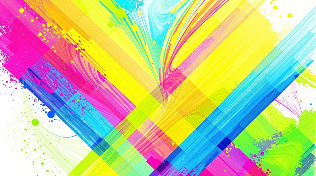
Creating unique looks with bright colors requires understanding fundamental color-blocking principles and strategic color combinations. The technique, pioneered by Yves Saint Laurent in the 1960s, employs a 60-30-10 ratio rule for ideal visual balance, with the dominant color occupying the largest proportion. Successful color-blocking involves pairing complementary hues from opposite sides of the color wheel, such as blue with orange or purple with yellow, while maintaining clear boundaries between color sections. Strategic placement of bright colors can enhance confidence and self-expression while creating striking visual effects. The art of mixing vibrant hues opens endless possibilities for developing a distinctive personal style through thoughtful color coordination.
Defining Color-Block Style
The vibrant fashion technique known as color blocking has evolved from its artistic roots in Piet Mondrian's paintings to become a dynamic style statement pioneered by Yves Saint Laurent. This distinctive approach incorporates strategically placed solid colors within garments to create bold visual effects through various methodologies, including monochromatic, tonal, and multi-color applications. The technique's implementation requires careful consideration of proportion, texture, and balance to achieve ideal aesthetic impact. Professional stylists recommend limiting outfits to two to three colors for optimal visual appeal.
Key elements of successful color blocking include:
- Strategic placement of clear, distinct color boundaries to create visual interest and structural definition
- Integration of complementary or contrasting hues while maintaining cohesive design principles
- Consideration of fabric weight and texture variations to enhance dimensional aspects
- Implementation of balanced proportions that harmonize with the wearer's silhouette
Color blocking transcends seasonal constraints through adaptable color palettes and can be executed through both pre-designed pieces and carefully curated separates. The technique's versatility allows for expression across formal and casual contexts, while maintaining its sophisticated appeal through thoughtful color selection and strategic placement of visual elements.
Selecting Complementary Color Combinations
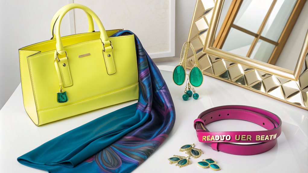
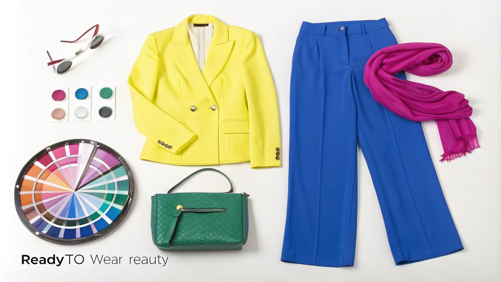
Mastering complementary color combinations stands as a fundamental principle in successful color-block fashion. These dynamic pairings, positioned opposite each other on the color wheel, create striking visual impacts that can elevate any ensemble. The classic combinations of red with green, yellow with purple, and blue with orange serve as foundational elements for creating sophisticated, eye-catching outfits.
To implement complementary colors effectively, maintain a strategic 70/30 ratio between the dominant and accent colors. For instance, incorporate a commanding blue blazer as the primary element, then introduce orange accessories such as a handbag or statement jewelry to achieve suitable balance. Consider incorporating neutral elements like black, white, or gray to moderate the intensity of these bold combinations while maintaining visual interest. Similar to how Membership Rewards Program offers flexibility in choices, mixing complementary colors allows for creative expression in fashion.
When selecting complementary color pairs, evaluate both the temperature consistency and your skin's undertones to guarantee a harmonious result. Experiment with varying saturations and values of these complementary hues, perhaps opting for softer pastels or muted tones to create more subtle yet equally impactful combinations. The key lies in maintaining cohesion through consistent color temperature while allowing the natural contrast of complementary pairs to create visual intrigue.
Balancing Bold Color Blocks
Building on the principles of complementary color pairings, successful color blocking requires a thoughtful approach to proportion and placement. The strategic arrangement of bold colors must consider both visual impact and body proportions, creating a harmonious balance that enhances rather than overwhelms. Understanding the relationship between color intensity and surface area is indispensable for achieving a sophisticated, well-coordinated ensemble.
To effectively balance bold color blocks, consider these essential guidelines:
- Establish a primary color that occupies approximately 60% of the outfit's visual space, typically using a more subdued or neutral tone as the foundation
- Incorporate a secondary color for 30% of the composition, selecting a shade that creates intentional contrast without competing for attention
- Reserve the boldest or brightest color for the remaining 10%, strategically placing it to draw attention to desired features
- Maintain vertical balance by distributing colors in a way that creates optical harmony from top to bottom
When executing this technique, consider the visual weight of each color and its placement relative to your body's natural lines. Darker shades naturally appear more substantial, while brighter hues draw immediate attention, making their strategic placement essential for achieving the desired silhouette.
Benefits
The practice of mixing and matching bright colors yields numerous advantages that extend beyond mere aesthetic appeal, including the opportunity for authentic self-expression through bold design choices and the creation of memorable outfits that leave lasting impressions.
Scientific research has demonstrated that wearing vibrant colors can profoundly enhance both mood and confidence levels, making color-blocking an effective tool for psychological well-being.
Additionally, the versatility of bright color combinations allows for year-round styling options, enabling wearers to adapt their looks across seasons while maintaining visual interest and personal flair.
Self-Expression Through Bold Design
While fashion trends may come and go, bold design choices offer lasting psychological and social benefits that extend far beyond mere aesthetics. Bold fashion serves as a powerful medium for self-expression, enabling individuals to communicate their personality, values, and creative vision without uttering a word. Through intentional selection of vibrant colors and distinctive patterns, people can craft a visual identity that authentically represents their inner world.
The incorporation of bold design elements in personal style functions as a form of non-verbal communication, conveying confidence and individuality. Experimentation with striking color combinations and patterns facilitates creative development and personal growth. Bold fashion choices can serve as a therapeutic outlet, helping individuals overcome body image concerns and boost self-esteem. The strategic use of distinctive design elements enables professionals to project authority and competence in workplace environments.
This approach to personal style transcends conventional fashion boundaries, allowing individuals to break free from societal constraints while fostering psychological well-being. By embracing bold design choices, people can create a unique aesthetic signature that reflects their authentic selves while building confidence and promoting positive self-image.
Makes Outfits More Memorable
Incorporating vibrant colors and bold combinations into outfits creates lasting impressions that extend far beyond initial encounters. The strategic use of bright hues, particularly red and yellow, increases physiological arousal in both the wearer and observers, making the ensemble more noticeable and memorable in professional and social settings. These colors stimulate heightened awareness and engagement, ensuring that one's presence remains distinct in others' memories.
The psychological impact of combining vibrant colors manifests in multiple dimensions of social interaction. When paired thoughtfully, warm colors like orange and magenta foster increased confidence and social engagement, while cool tones such as blue and green establish an approachable demeanor. This dynamic interplay of colors not only enhances the wearer's visibility but also influences audience perception and engagement levels during presentations or meetings.
Additionally, the intentional incorporation of bright colors into outfits can transform social dynamics by creating a memorable visual anchor that others associate with positive interactions. The combination of darker shades with balanced lighter tones adds depth to the overall appearance, ensuring that distinctive features stand out while maintaining professional sophistication.
Boosts Mood and Confidence
Beyond creating memorable impressions, bright color combinations serve as powerful mood enhancers and confidence boosters for their wearers. Scientific research demonstrates that specific colors stimulate physiological responses, with warm hues like red and yellow increasing heart rate and alertness, while cool tones such as blue and green promote emotional well-being through their connection to nature. The strategic incorporation of these colors into wardrobes can critically impact both personal confidence and social dynamics.
Red garments enhance assertiveness and motivation, making them ideal for professional presentations or high-stakes social encounters. Yellow pieces stimulate neural activity and sharpen memory, contributing to improved communication and mental acuity. Green elements promote emotional balance while preserving energy, perfect for sustained creative performance. Bright color combinations increase dopamine levels, particularly beneficial during darker seasons when mood enhancement is essential.
The psychological impact of wearing vibrant colors extends beyond personal benefits, influencing social interactions by fostering open communication and reducing negative emotions. When strategically combined, these colors create a powerful tool for managing emotional states while projecting confidence in both professional and social settings.
Creates Year-Round Versatility
The versatility of bright colors in fashion extends far beyond seasonal limitations, offering a dynamic foundation for year-round wardrobe adaptability. Through strategic layering and thoughtful combinations with neutral pieces, vibrant hues can transfer seamlessly across seasons, maximizing the utility of each garment.
The integration of bright colors with various textures and materials, from lightweight linens to substantial woolens, enables continuous wardrobe evolution throughout the year.
This adaptability manifests through multiple styling approaches. Summer-oriented bright pieces can extend into cooler months when layered beneath neutral blazers or cardigans, while autumn's rich mustards and deep greens harmonize effectively with year-round staples like beige, tan, and cream.
The intensity of bright colors can be modulated seasonally, with softer iterations appearing in fall and bolder versions emerging in spring and summer. Additionally, the incorporation of bright colors into essential pieces facilitates the creation of diverse outfits suitable for any season. By pairing these versatile items with different textures, patterns, and complementary hues, one can maintain a fresh, adaptable wardrobe that functions effectively throughout the entire year.
Color-Pairing Style Guides
Understanding color combinations requires mastering fundamental color wheel principles, which serve as the foundation for creating cohesive and visually appealing outfits. The interaction between warm and cool tones presents opportunities for striking contrasts, while seasonal color trends provide guidance for appropriate pairings throughout the year. These principles, when applied thoughtfully, enable fashion enthusiasts to construct sophisticated ensembles that demonstrate both technical understanding and artistic sensibility.
| Style Guide | Key Principles | Recommended Combinations |
|---|---|---|
| Color Wheel | Complementary pairs create dynamic contrast | Red-Green, Blue-Orange, Purple-Yellow |
| Primary Colors | Base colors form foundation | Blue-Red-Yellow in varying intensities |
| Secondary Colors | Derived from primary mixtures | Green-Orange-Purple with neutrals |
| Warm Tones | Energetic and advancing colors | Red-Orange-Yellow with earth tones |
| Cool Tones | Calming and receding colors | Blue-Green-Purple with grey accents |
Color Wheel Basic Rules
Mastering color wheel basics provides essential guidelines for creating visually appealing color combinations in any design project. Understanding the relationships between primary, secondary, and tertiary colors enables designers to create sophisticated palettes that effectively communicate visual messages while maintaining harmony and balance.
The fundamental rules of color wheel combinations can be systematically applied through several well-established approaches:
- Complementary color schemes utilize colors positioned opposite each other on the wheel, creating maximum contrast and visual impact while remaining harmonious when properly balanced with varying saturations
- Analogous combinations incorporate three adjacent colors, offering natural progression and subtle shifts that mirror patterns commonly found in nature
- Triadic arrangements employ three equidistant colors, forming an equilateral triangle on the wheel, providing vibrant contrast while maintaining color harmony
- Primary color relationships serve as the foundation, with red, blue, and yellow forming the basis for all other color mixing possibilities
These systematic approaches to color combination enable designers to make informed decisions about palette selection, ensuring both aesthetic appeal and functional effectiveness in their creative endeavors. Understanding these rules facilitates innovative color applications while maintaining visual coherence.
Warm Vs Cool Combos
Successful color pairing often hinges on the interplay between warm and cool tones, creating dynamic visual relationships that can either harmonize or energize an outfit. Understanding the fundamental distinction between warm colors (red, orange, yellow, and earth tones) and cool colors (green, blue, and purple) enables sophisticated styling decisions that transcend basic color coordination.
The strategic combination of warm and cool elements requires careful consideration of both intensity and proportion. While pairing non-neutral warm and cool colors demands expertise, incorporating neutral elements can facilitate seamless shifts. For instance, combining warm-toned khaki trousers with a cool blue blazer creates a refined yet approachable aesthetic. Additionally, matching chroma levels between warm and cool colors helps maintain visual balance, even when temperature contrasts exist.
Contemporary styling emphasizes the importance of considering both personal coloring and environmental context. While cool colors traditionally connote urban sophistication and formality, warm colors suggest casual refinement and natural settings. Accessories play a pivotal role in reinforcing intentional warm-cool combinations, while complementary color pairings can introduce calculated tension that elevates the overall composition.
Seasonal Pairing Trends
The ever-evolving landscape of fashion in 2024 brings forward distinctive seasonal color combinations that build upon the principles of warm and cool pairings.
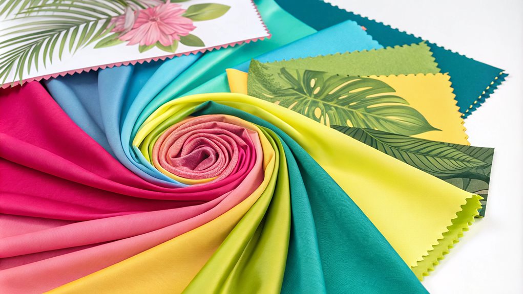
Spring introduces a harmonious blend of pastels with bold accents, where delicate pink and soft lilac meet vibrant yellows and striking oranges. Summer morphs into fresh, nature-inspired palettes featuring mint green and coral, complemented by sustainability-focused dyes and materials.
As autumn approaches, the color story shifts dramatically toward sophisticated neutrals punctuated by electric accent shades. The seasonal progression demonstrates these key developments:
- Spring's metallic silver serves as a connective element, bridging pastel foundations with bolder statement colors
- Summer's chambray blue creates versatile foundations when paired with various wash levels of denim and crisp whites
- Fall's corporate-proof grays and heathered textures establish a quiet luxury aesthetic
- Year-round earth tones provide consistent anchoring elements for seasonal statement colors
This methodical approach to seasonal color integration allows for strategic wardrobe building while maintaining relevance across changing trends. The interplay between bold statement shades and grounding neutrals creates sophisticated, adaptable looks suitable for various occasions and style preferences.
Top Beauty Brands
Our beauty studio specializes in creating vibrant, customized looks using products from leading brands like Rare Beauty, Charlotte Tilbury, and Fenty Beauty. We offer expert color mixing consultations where our certified makeup artists help clients combine bold shades and textures, drawing from innovative products across top beauty lines that Gen Z loves, including e.l.f. and Maybelline.
Through personalized tutorials, we teach proper application techniques for achieving Instagram-worthy results, incorporating trending products featured by beauty influencers on social media. Our services extend to skincare recommendations featuring advanced formulations from brands like goop and Rhode, ensuring clients have the perfect canvas for their colorful makeup looks while maintaining healthy skin.
Seasonal Color Trend Forecasts
As we progress through the seasons, color trends evolve to reflect the mood and environment of each time of year.
| Season | Key Colors | Influences |
|---|---|---|
| Spring 2024 | Pastel pink, soft lilac, baby blue, lively green, bright orange, vibrant yellow | Airy and fresh atmosphere, sustainability, natural elements |
| Summer 2024 | Lilac, mint green, coral, sun yellow, sky blue, rich green, warm earth tones | Connection to nature, positive attitude |
| Fall 2024 | Deep berry tones, reds, oranges, purples, Intense Rust, Midnight Plum, Apricot Crush | Earthy tones, cool and calming shades |
These seasonal color trends highlight a balance between calming neutrals and vibrant colors, emphasizing sustainability and a connection to nature.
Spring-Summer Palette Predictions
Fashion forecasts for Spring/Summer 2025 reveal a sophisticated interplay between bold statements and soft shifts, with leading design houses showcasing an evolved color palette. Major fashion houses are embracing a nuanced approach, balancing vibrant statements with subdued sophistication. Chanel and Ralph Lauren have masterfully incorporated various blue tones, while Versace and Miu Miu have championed invigorating mint greens.
The season's palette demonstrates remarkable versatility through these key developments:
- Elevated neutrals featuring butter-yellow and creamy tones, particularly evident in Schiaparelli and Proenza Schouler collections
- Strategic deployment of maroon and deep reds by Bottega Veneta and Ferragamo, often presented in monochromatic ensembles
- Integration of soft pastels, especially in blue spectrums, showcased through Victoria Beckham's innovative denim pieces
- Balanced incorporation of earth tones with classic bold colors, emphasizing sophisticated combinations and textural variations
This evolutionary approach to color reflects the industry's movement toward more sustainable and versatile wardrobing options, with designers like Maison Margiela and Gucci incorporating deconstructed elements and innovative texturing techniques to enhance color dimensionality.
Fall-Winter Color Combinations
Three distinct color palettes define the Fall/Winter 2024 season, showcasing a rich interplay between earthy luxe tones, bold statements, and sophisticated neutrals. Leading the earthy spectrum, Olive Green emerges in both Taggiasca and Castelvetrano variations, while Chocolate Brown and Burgundy establish a foundation for luxurious seasonal styling.
The bold spectrum introduces Klein Blue as a transformative force, particularly when paired with neutral foundations like sand beige or eggshell. Cherry Tomato Red and various oceanic blues, from tropical to starlight variations, inject vibrancy into winter wardrobes through statement pieces and accessories.
For those seeking refined sophistication, the neutral palette presents Corporate Gray and Navy Blue as versatile anchors, while Eggshell and Pale Pink offer subtle alternatives to traditional winter whites. These combinations create numerous styling possibilities, with particularly striking results when pairing burgundy with khaki green, Klein Blue with beige, or chocolate brown with olive tones. The strategic layering of these colors allows for both subtle sophistication and bold statement-making, depending on the desired effect and occasion.
Global Fashion Color Shifts
The global fashion landscape in 2024 reveals distinct seasonal color progressions, with each period showcasing its unique palette and mood. From the delicate pastels of spring to the vibrant combinations of summer, the evolution demonstrates a sophisticated interplay between environmental consciousness and aesthetic innovation.
As international markets adapt to changing consumer preferences, several significant color shifts are emerging across seasons:
- Spring's progression from muted pastels to bold neons reflects a global shift toward experimental color combinations, particularly in Asian and European markets
- Summer's emphasis on sustainable dyes and natural pigments indicates a growing environmental awareness, especially prominent in Scandinavian and North American regions
- The persistence of warm neutrals throughout the year demonstrates a universal desire for versatile, investment-worthy pieces that transcend seasonal boundaries
- The strategic incorporation of metallic accents shows an evolution in how different cultures interpret luxury and sophistication
These color progressions demonstrate the fashion industry's responsiveness to cultural shifts, environmental concerns, and technological advancements in textile production, while maintaining a balance between bold expression and practical versatility.
FAQ
How Do Bright Colors Affect Mood and Confidence When Worn Together?
Bright colors worn together create synergistic effects, amplifying positive mood and confidence through enhanced visual stimulation, while strategic combinations can optimize psychological impact and project powerful personal presence.
Can People With Different Skin Undertones Wear the Same Color Combinations?
Different skin undertones can share color combinations through strategic styling. Neutral tones bridge gaps, while jewel tones and teal offer versatility across undertones when paired thoughtfully with complementary shades.
What Role Does Fabric Texture Play When Mixing Bright Colors?
Fabric texture considerably impacts bright color combinations by controlling intensity, depth, and light reflection. Matte textures soften vibrant hues, while shiny fabrics intensify them, creating dynamic visual interplay.
How Do Cultural Differences Influence Bright Color Mixing Preferences?
Cultural influences substantially shape bright color combinations, with Eastern cultures often embracing vibrant pairings, while Western preferences lean toward controlled contrasts balanced with neutral tones for modern sophistication.
Are There Specific Bright Color Combinations That Photograph Better Than Others?
High-contrast complementary pairs like blue-orange and red-green consistently produce striking photographs, while triadic combinations of primary colors create dynamic, eye-catching images with excellent depth and visual interest.