Bold color trends from the runway are becoming increasingly accessible for everyday wear through strategic styling approaches. The movement embraces vibrant hues like bright tangerine and electric violet, while incorporating unexpected pairings such as cobalt blue with hot pink. Modern fashion emphasizes balanced color blocking, utilizing crisp whites and neutrals as foundational elements. Statement accessories, including two-tone earrings and gradient belts, offer manageable ways to experiment with bold colors. Leading beauty brands have also adapted these trends into wearable cosmetics, featuring everything from vivid pink lipsticks to calming blue-tinted serums. These contemporary styling techniques reveal endless possibilities for personal expression through color.
Mixing Bold Color Pairs
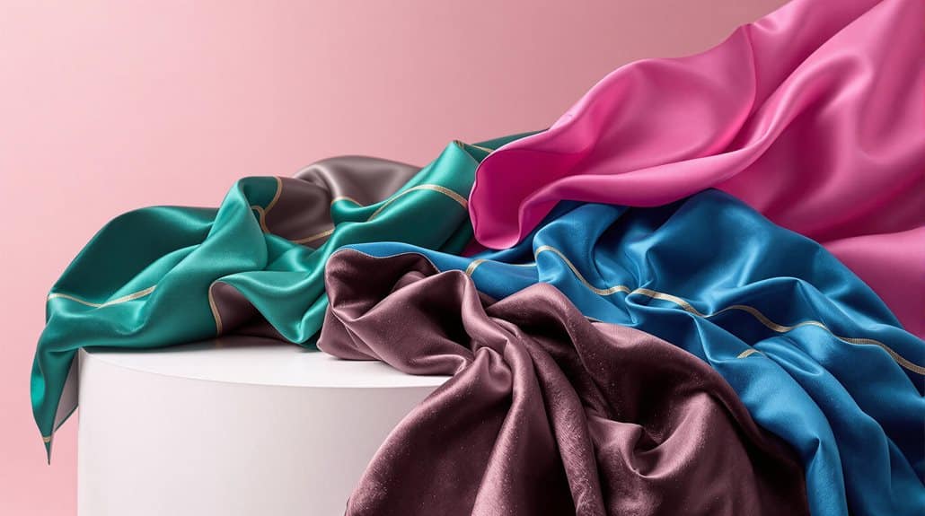
When it comes to mastering bold color combinations in fashion, color-blocking stands as one of the most striking and influential movements in recent years. Contemporary palettes featuring Scarlet Smile and Golden Palm demonstrate how contrasting hues can create visually compelling ensembles when paired strategically.
The integration of deep Aventurine with vibrant Red Orange exemplifies the sophisticated approach to modern color-blocking. Different textures within color-blocked outfits create additional visual interest and dimension.
To execute these combinations successfully, begin with a statement piece in one of these bold shades, then build the outfit using complementary or analogous colors. The key lies in understanding how to balance intensity through thoughtful layering and strategic placement of colors.
For instance, a Cherry Red blazer can be harmoniously paired with neutral elements or complementary hues, while metallic accessories provide subtle enhancement without overwhelming the overall composition.
Success in bold color-blocking requires both technical understanding and artistic intuition. Consider texture variations to add depth, and always keep proportion in mind when combining different colored elements.
Maintaining awareness of current runway trends while adapting them to personal style guarantees that these vivid combinations remain both fashionable and wearable in everyday contexts.
Unexpected Combinations That Work
Breaking away from conventional color rules, modern fashion embraces unexpected combinations that challenge traditional style boundaries. Design luminaries like Christopher John Rogers and Proenza Schouler have pioneered striking pairings such as cobalt blue with hot pink and lime green with bold orange, demonstrating how discordant hues can create harmonious statements. These revolutionary combinations have found validation through celebrity endorsements, with style icons like Victoria Beckham and Jennifer Lopez confidently sporting clashing colors on high-profile occasions. The Spring/Summer 2024 runways highlighted this daring approach as a central theme for the upcoming season.
The key to mastering these unconventional pairings lies in strategic implementation and textural variation. Incorporating neutral elements serves as an essential anchor, whether through accessories like black belts or white sneakers, while mixing fabric textures adds sophisticated dimension to bold color stories. For instance, pairing a satin neon green blouse with a matte-finish purple skirt creates visual interest beyond the color contrast alone. These combinations work particularly well in creative professional environments and social settings, where fashion-forward expression is celebrated. The modern approach to color-blocking demonstrates that seemingly disparate hues can coexist beautifully when executed with intention and confidence.
Color-Block Accessories Guide
Mastering color-block accessories requires strategic selection and thoughtful placement within an outfit. The implementation of color-blocked elements through accessories provides a sophisticated method to introduce visual intrigue while maintaining professional restraint. When incorporating these statement pieces, consider utilizing the sandwich technique, which creates cohesion by matching accessories at the top and bottom of an ensemble.
Color-blocked handbags represent an exemplary starting point for those exploring this trend, as they offer maximum impact with minimal commitment. The key lies in selecting pieces that complement both your natural coloring and existing wardrobe while adhering to fundamental color theory principles. When paired with color-blocked outerwear or blouses, accessories should be chosen deliberately to prevent visual competition, often through the incorporation of neutral elements that ground the overall composition.
For ideal execution, maintain a balanced approach by limiting color-blocked accessories to one or two statement pieces per outfit. This might include a two-tone bracelet paired with coordinating footwear, or a color-blocked purse complemented by modest pumps in a corresponding hue. The strategic placement of these elements creates a refined aesthetic while maintaining visual hierarchy within the ensemble.
Benefits
Color trends offer significant psychological and social advantages that extend beyond mere aesthetics, with carefully selected hues proven to elevate mood and boost self-confidence while allowing individuals to articulate their unique personality.
Through strategic color choices, people can create memorable first impressions and distinguish themselves in professional and social settings, establishing a distinctive personal brand that resonates with others.
The thoughtful application of trending colors enables individuals to craft a sophisticated visual narrative that commands attention and reflects contemporary style sensibilities while maintaining authenticity in self-expression.
Boosts Mood and Confidence
Through their profound psychological impact, certain hues can markedly influence our emotional state and self-assurance. Red, renowned for its energizing properties, stimulates both physiological and psychological responses, elevating heart rate while simultaneously projecting confidence and authority.
Yellow and orange, with their inherent brightness, serve as catalysts for optimism and creative expression, making them particularly beneficial during periods of low mood or seasonal affect.
The strategic implementation of color extends beyond singular choices to encompass sophisticated combinations. Complementary color pairings create visual impact while fostering self-assurance, particularly evident in fashion applications where bold contrasts command attention.
Blue, traditionally associated with tranquility, takes on a different dimension when utilized in unexpected ways, such as in statement suiting that communicates refined confidence. Purple, with its historical connections to nobility, introduces an element of creative sophistication that can enhance one's sense of individuality and presence.
For ideal psychological benefit, incorporating a balanced spectrum of both energizing and calming hues allows for inclusive mood enhancement while maintaining emotional equilibrium, particularly in professional and personal environments where confidence is paramount.
Enhances Personal Style Expression
An individual's command of color serves as a powerful vehicle for personal style expression, enabling authentic self-representation through carefully curated choices. The diverse 2024 color palette, ranging from delicate pastels to bold statement hues, provides an extensive framework for crafting distinctive wardrobes that reflect personal aesthetics and values.
This expansive spectrum facilitates multifaceted expression through strategic combinations and layering techniques. The integration of retro-inspired colors allows individuals to incorporate nostalgic elements while maintaining contemporary relevance. For instance, the resurgence of slime-green and cherry red enables wearers to make bold statements while honoring historical fashion references.
The versatility of earth tones and neutrals serves as a sophisticated foundation, allowing for seamless shifts between professional and casual settings. The thoughtful incorporation of cultural influences, such as Brat green and vibrant yellows, demonstrates awareness of current trends while maintaining individuality. Through the strategic utilization of accessories in bold colors like scarlet smile and bright orange, individuals can craft nuanced expressions of personal style that evolve effortlessly across seasons and occasions, reflecting both confidence and cultural consciousness.
Stands Out From Crowd
How effectively a person stands out in today's visually saturated world often depends on their strategic use of bold and distinctive colors. The implementation of vibrant hues and contrasting combinations has become increasingly significant in contemporary fashion, as evidenced by recent runway presentations from prestigious houses like Gucci and Bottega Veneta.
These influential designers have demonstrated the impact of intentional color selection through their masterful use of cherry red and pale blue in their collections.
The strategic deployment of bold colors can differentiate an individual through:
- Immediate Visual Impact: Bright orange, lively green, and vibrant blue create instant recognition in crowded environments
- Calculated Contrast: The juxtaposition of bold shades against neutral foundations maximizes visibility and aesthetic appeal
- Statement Piece Integration: Strategic positioning of vivid colors in key garments guarantees memorable presence
- Cultural Resonance: Incorporating trending colors like viral lime green or post-Barbie pink demonstrates cultural awareness
This approach to color utilization transcends mere aesthetic preference, becoming a powerful tool for personal branding and social distinction. The careful selection of bold colors, particularly in statement pieces and contrasting combinations, creates a sophisticated visual strategy that commands attention in professional and social settings.
Makes Lasting First Impression
When skillfully selected and coordinated, colors possess remarkable power to create memorable first impressions that resonate long after initial encounters. The strategic incorporation of Pantone's 2024 Color of the Year, Peach Fuzz, alongside bold statements like Cherry Tomato red and mirror silver accents, establishes an immediate visual impact that demonstrates both trend awareness and personal confidence.
The deliberate selection of earth tones, such as chocolate brown and terracotta, communicates sophistication and environmental consciousness, while vibrant blues and energetic oranges project optimism and innovation. These thoughtfully chosen hues, when implemented through various textures and layering techniques, create depth and dimension that captivate attention.
The integration of runway-inspired combinations, such as pairing bold metallics with soft pastels or incorporating trending oxblood with sustainable olive green, demonstrates a refined understanding of contemporary fashion dynamics.
Through the strategic implementation of these color elements, whether through statement pieces or carefully chosen accessories, individuals can craft a lasting visual narrative that effectively communicates their personal brand and professional identity, ensuring their presence leaves an indelible impression in professional and social contexts.
Mixing Bold Prints Together
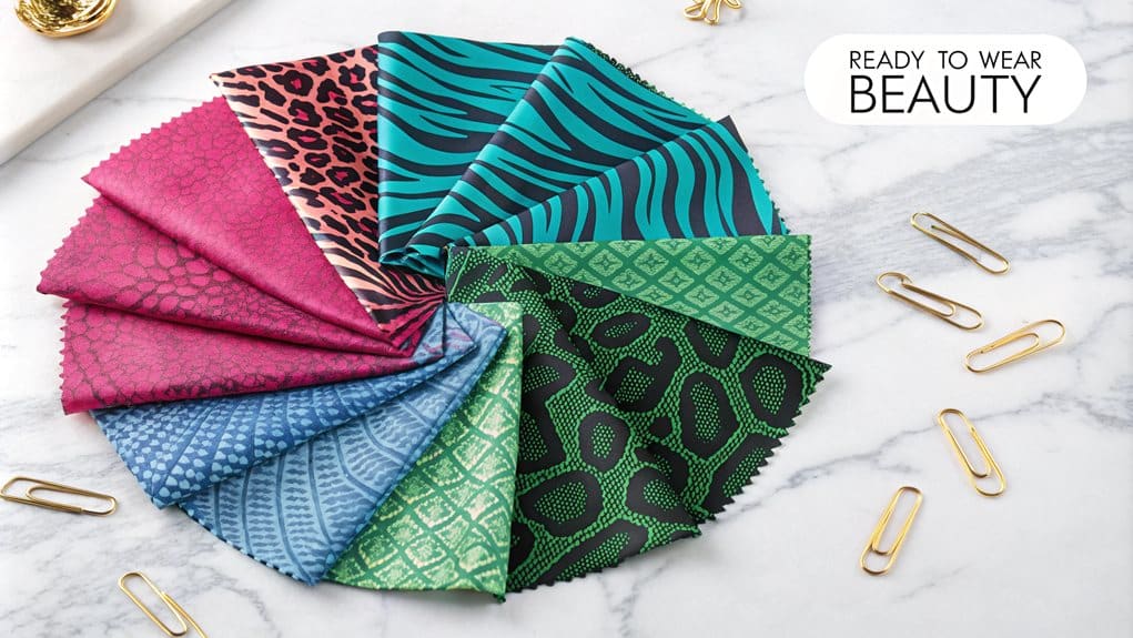
When mixing bold prints together, understanding the relationship between scale and proportion becomes essential, as combining large-scale patterns with smaller ones creates visual harmony and prevents overwhelming the eye. The coordination of colors within different print patterns serves as a unifying element, allowing seemingly disparate prints to work cohesively through shared color palettes or complementary hues. The art of balancing busy prints with simple elements provides necessary visual rest points and maintains aesthetic equilibrium in the overall composition.
| Pattern Type | Key Considerations | Best Practices |
|---|---|---|
| Large Scale | Dominant focal point | Limit to one major piece |
| Small Scale | Supporting elements | Use as accent pieces |
| Mixed Prints | Color coordination | Share at least one color |
Scale: Big Vs Small
The art of mixing bold prints and colors requires careful consideration of scale and proportion. When incorporating vibrant hues and patterns into your wardrobe, understanding the relationship between large-scale statements and subtle accents becomes crucial for creating balanced, sophisticated ensembles. While dramatic pieces in cherry red or mirror silver can dominate an outfit, strategic placement of smaller color elements through accessories and carefully chosen prints helps maintain visual harmony.
- Statement-to-Accent Ratio: Pair one large-scale bold element, such as a bright orange coat, with smaller complementary pieces in warm neutrals or earth tones
- Layering Dynamics: Create depth by combining different-sized prints, using larger patterns for outerwear and smaller patterns for underlayers
- Accessory Balance: Offset substantial color blocks with delicate, bold-colored accessories like scarves or jewelry
- Texture Variation: Integrate different scales of texture, from large metallic surfaces to small printed patterns, maintaining cohesion through coordinated color stories
This strategic approach to scaling color and print allows for sophisticated experimentation while ensuring the overall look remains polished and intentional, whether shifting between seasons or crafting signature everyday ensembles.
Color-Matching Print Patterns
Successfully mixing bold prints together demands a strategic approach to color harmony and pattern coordination. The key lies in understanding complementary and analogous color relationships while maintaining visual balance through thoughtful pattern selection. When combining different prints, consider pairing complementary colors, such as emerald green with ruby red, to create striking contrasts that captivate attention.
For sophisticated pattern mixing, start by combining classic combinations like stripes with florals or polka dots with geometric designs. The scale of these patterns should be deliberately varied, with one print serving as the dominant element while the other acts as a complementary accent. To maintain cohesion, incorporate neutral backgrounds or monochromatic accessories that tie the ensemble together. Consider texture variations to add depth, such as mixing wool plaids with metallic-accented paisley prints.
Seasonal considerations profoundly influence color selection in print mixing. Autumnal combinations benefit from rich hues like terracotta and olive green, while incorporating metallic accents such as bronze or gunmetal gray adds a contemporary edge. For a more subdued approach, experiment with monochromatic prints in varying shades of the same bold color.
Balance Busy With Simple
Mastering bold print combinations requires a strategic balance between busy and simple elements. When incorporating vibrant patterns and colors, it is crucial to ground them with neutral foundations that prevent visual overwhelm.
The strategic use of earth tones like terracotta, olive green, and chocolate brown creates a sophisticated canvas for more adventurous color choices, while classic neutrals such as navy blue and gray provide stability for bold artistic expressions.
- Pair statement accessories in cherry red or bright orange with neutral backgrounds of cream or beige to create focal points without overwhelming the overall composition
- Layer bold prints over solid earth-tone pieces, using olive green or terracotta as anchoring components that enhance visual harmony
- Incorporate metallic accessories strategically with bold colors to add dimension while maintaining balance through neutral base pieces
- Utilize pastel elements like soft lilac or baby blue to facilitate transitions between bold patterns and neutral foundations
This methodical approach to combining busy and simple elements allows for creative expression while maintaining visual coherence. The key lies in establishing a hierarchy where bold statements are supported by carefully chosen neutral elements, resulting in sophisticated, well-balanced ensembles.
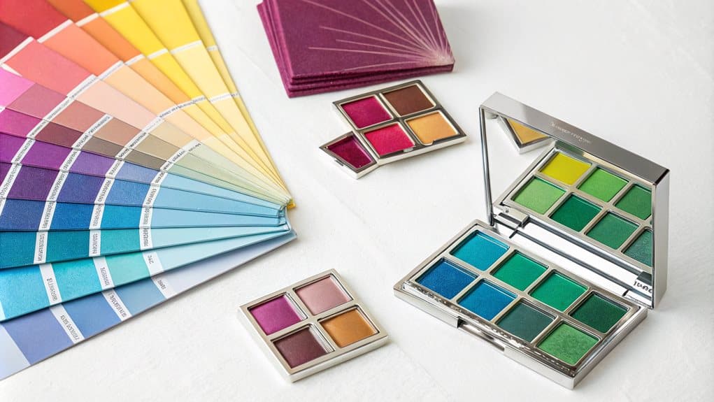
Top Beauty Brands
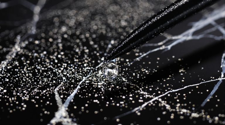
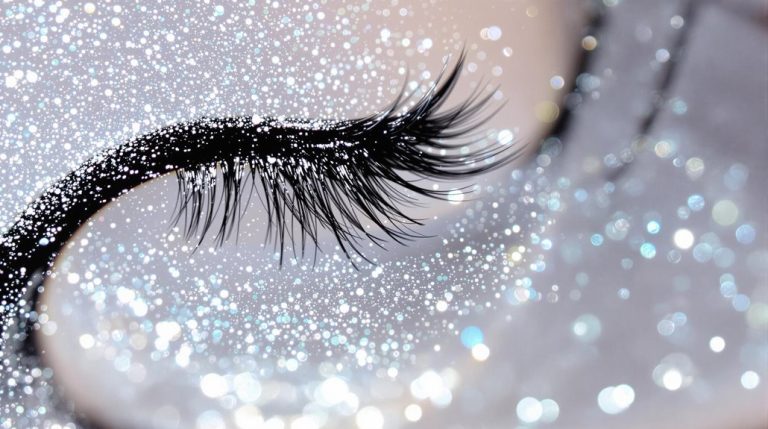
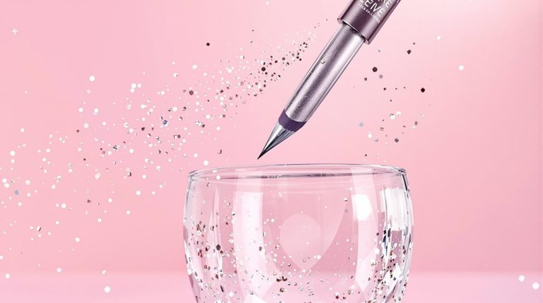
Leading beauty brands are embracing 2024's diverse color palette to help customers express their personal style through makeup, skincare, and beauty products. From vibrant pink lipsticks and aqua eye shadows that align with the bright trend to calming blue-tinted serums that promote wellness, beauty companies are formulating products that complement every skin tone and preference.
Luxury brands are incorporating rich chocolate browns and deep wines into their collections, while also offering neutral, earthy tones for a more subtle look. These color innovations extend across foundations, concealers, and cosmetics, allowing customers to experiment with both bold statement looks and natural, quiet luxury aesthetics that mirror current fashion trends.
Styling Colorful Statement Accessories

When it comes to styling colorful statement accessories, the summer of 2024 is all about making a bold impression. Neon bags are trending, adding a vibrant touch to any outfit, while mixing bright shoe pairings can create a striking ensemble. Statement jewelry, featuring oversized earrings and chunky rings with large gemstones, continues to dominate the scene.
| Accessory Type | Color Trends | Design Elements |
|---|---|---|
| Neon Bags | Bright blues, | Rich textures, |
| vibrant reds, | unexpected materials | |
| eye-catching yellows | ||
| Bright Shoe Pairings | Butter yellow, | Bold patterns, fun |
| powder blue, | designs, architectural | |
| cherry or ruby red | silhouettes | |
| Statement Jewelry | Bright blues, | Large gemstones, unique |
| vibrant reds, | shapes, intricate designs | |
| eye-catching yellows |
Neon Bags Make Waves
The resurgence of neon bags has transformed the accessories landscape, with fashion houses embracing electric hues and bold statement pieces across their collections. Leading designers have integrated vibrant statement straps and eye-catching details into their repertoires, creating versatile pieces that serve as the focal point of any ensemble.
The trend extends beyond traditional fluorescent variations, incorporating innovative materials and unconventional shapes that challenge conventional accessory paradigms.
This revolutionary approach to accessory design manifests in several distinctive ways:
- Interchangeable neon straps that allow wearers to customize classic bags with bold, contemporary elements
- Integration of iridescent fabrics and metallic finishes that amplify the visual impact of neon colorways
- Implementation of sustainable materials in striking neon hues, particularly in recycled plastic and vegan leather options
- Strategic combination of neon elements with clear or transparent materials, creating a modern juxtaposition of textures
The emergence of these bold chromatic choices reflects a broader shift toward experimentation in accessory design, with brands like Balmain and Versace leading the charge through their incorporation of shimmering details and innovative color applications.
Mix Bright Shoe Pairings
Building on the neon accessories movement, bright footwear has emerged as a dynamic way to express personal style and create compelling outfit combinations. From cherry-red sandals paired with sky-blue ensembles to lime-green sneakers contrasting against neutral backdrops, these bold choices serve as transformative elements in contemporary fashion.
Strategic styling approaches maximize the impact of colorful footwear while maintaining sophistication. Creating harmonious looks involves repeating color themes throughout an outfit, while monochromatic ensembles allow vibrant shoes to command attention. For those seeking balanced experimentation, pairing brightly colored footwear with neutral foundations offers controlled yet striking results.
The incorporation of seasonal palettes, such as summer-inspired pinks and rich blues, ensures relevance throughout warmer months, with potential to integrate into pre-fall wardrobes. Advanced styling techniques include color blocking, where shoes provide concentrated bursts of color against pristine white or neutral compositions. This approach particularly suits those exploring maximalist territory through printed or gradient-detailed footwear.
The key lies in thoughtful execution, whether embracing strong contrasts or subtle color coordination, allowing personal style preferences to guide the selection of silhouettes and color combinations.
Statement Jewelry Goes Bold
Statement jewelry has evolved into a powerful form of self-expression, with bold colors and dramatic gemstones taking center stage in 2024's accessory landscape. The convergence of emerald greens, sapphire blues, and ruby reds alongside diverse gemstones like amethyst, citrine, and topaz creates sophisticated designs that command attention while maintaining versatility across various settings.
Contemporary statement pieces demonstrate remarkable adaptability, seamlessly shifting from professional environments to evening occasions. The strategic incorporation of oversized earrings, chunky necklaces, and sculptural metal pieces allows for dynamic styling possibilities, particularly when paired with minimalist attire that serves as an elegant canvas for these bold accessories.
- Layer multiple necklaces of varying lengths and textures, combining both metallic and gemstone elements for a curated, dimensional look
- Select oversized geometric earrings featuring vibrant stones to create focal points that frame the face
- Incorporate Art Deco-inspired pieces with bold lines and striking colors for a sophisticated, architectural statement
- Experiment with baroque and colored pearls in statement designs to blend classic elegance with contemporary boldness
FAQ
How Do I Choose Bold Colors That Complement My Skin Undertone?
Identify your undertone first: cool (pink/blue), warm (yellow/golden), or neutral. Select bold colors accordingly – jewel tones for cool, earthy vibrancy for warm, and diverse palettes for neutral undertones.
Can Petite Body Types Wear Color-Blocking Without Appearing Overwhelmed?
Petite frames can successfully wear color-blocking by limiting combinations to two or three colors, using vertical blocks, and choosing fitted silhouettes with strategically placed contrasting colors to elongate proportions.
Which Bold Colors Are Best for Professional Office Environments?
Deep blues and electric blues convey authority while maintaining professionalism. Strategic accents of rich oranges or vibrant yellows can energize workspaces without overwhelming the professional atmosphere.
How Do I Maintain Vibrant Colors Without Fading After Multiple Washes?
Preserve color vibrancy by washing in cold water, using color-protecting detergents, avoiding direct sunlight exposure, and air-drying garments. Select quality natural fibers and pre-treat with color-fixing solutions before first wash.
What Lighting Conditions Affect How Bold Colors Appear in Photographs?
Natural light during golden hour enhances warm tones, while diffused lighting maximizes saturation. Fluorescent lighting can add cooler tints, and side lighting creates depth that amplifies bold colors' impact.