
Pastel colors create sophisticated and emotionally resonant environments for special events through strategic implementation of muted hues and complementary color combinations. Event planners can incorporate these gentle tones through layered textiles, floral arrangements, table settings, and architectural elements while using neutral anchors like white or gray to maintain visual balance. Soft shades effectively evoke feelings of tranquility and refinement while remaining versatile enough to adapt to various event styles, from modern minimalist to traditional romantic themes. The thoughtful integration of pastel accents with varied textures and subtle metallic elements elevates the overall design aesthetic, transforming ordinary spaces into extraordinary experiences that captivate guests and create lasting impressions.
Muted Tones For Harmony
Among the most enchanting aspects of event design, muted pastel tones create an atmosphere of refined elegance and visual harmony. These sophisticated color combinations, such as dusty blue paired with sage and silver, establish a contemporary aesthetic while maintaining a sense of tranquility. The integration of these subdued hues produces an environment that's both visually appealing and psychologically soothing for event attendees.
When implementing muted tones, designers often incorporate complementary elements like lightly colored terracotta vessels and gentle fabric textures to enhance the overall ambiance. The combination of lilac with pear green, for instance, offers a distinctive approach that maintains sophistication while introducing subtle visual interest. Sheer chiffon can be elegantly tied to ceremony chair backs to add dimension to the space. These carefully selected color pairings can be further elevated through the strategic use of chiffon and organza in table settings and architectural elements.
For brand-conscious events, muted pastels serve a dual purpose: they create an aesthetically pleasing environment while reinforcing brand values and messaging. By selecting complementary colors from the pastel spectrum, event designers can craft spaces that resonate with target audiences while maintaining professional sophistication and emotional resonance.
Blending Light Color Families
Mastering the art of blending light color families requires understanding how different pastel shades interact to create sophisticated palettes. When combining these gentle hues, designers must consider both psychological impact and visual harmony, particularly in creating atmospheres that evoke specific emotional responses for special events. The strategic pairing of soft spring combinations, such as lavender with baby pink, or powder blue with ivory, can establish precisely calibrated environments that communicate freshness and tranquility. These combinations are especially effective for refined and sophisticated events, as pastel colors naturally convey elegance and grace.
For maximum effectiveness, event designers should incorporate pastel combinations using the principle of balanced contrast. This approach might involve anchoring ethereal mint green and coral combinations with neutral backgrounds, or juxtaposing soft yellows against deeper accent colors to create visual depth. The implementation of harmonious blends, whether through analogous or complementary relationships, enables sophisticated shifts between color families while maintaining coherence throughout the event space.
When executing these combinations, particular attention should be paid to lighting conditions, as natural and artificial illumination can drastically affect how pastel hues interact, potentially altering their perceived intensity and emotional impact within the designed environment.
Balancing Neutral With Pastels
The strategic balance between neutral tones and pastel shades forms a crucial foundation for sophisticated event design. By incorporating neutral anchors like white, gray, or beige, event planners can create a polished backdrop that prevents pastel elements from overwhelming the aesthetic. These foundational colors serve as stabilizing forces, allowing the softer hues to shine without creating visual chaos.
To achieve an ideal balance, designers should strategically distribute pastel accents throughout the space while maintaining larger areas of neutral tones. This can be accomplished through careful selection of table linens, floral arrangements, and decorative elements that incorporate both color families. The integration of varying textures and subtle patterns, such as herringbone or delicate florals, adds depth while maintaining sophistication.
In addition, the addition of metallic accents, such as rose gold or pearl finishes, can elevate the overall design when used judiciously. For maximum impact, consider limiting the number of pastel colors to prevent visual clutter, instead focusing on creating meaningful contrast through complementary or analogous color combinations. This approach ensures that each pastel element serves a purposeful role in the overall design scheme while maintaining harmony with the neutral foundation.
Benefits
The strategic incorporation of pastel colors into special events offers multiple psychological and aesthetic advantages that contribute to the overall success of gatherings and celebrations. These gentle hues work together to create an atmosphere of sophistication and tranquility, while simultaneously providing event planners with extensive creative possibilities through various color combinations and applications.
The versatility of pastels extends beyond mere decoration, as these colors actively enhance guests' emotional well-being by promoting feelings of calmness and contentment throughout the event space.
Enhances Mood and Atmosphere
Colors serve as powerful mood influencers, and pastel hues excel at creating atmosphere through their gentle, understated presence. These less saturated tones, including baby blue, pastel pink, and pale yellow, deliver a universally calming effect while reducing visual stimulation. The implementation of pastel colors strategically enhances event spaces by fostering an environment conducive to relaxation and stress reduction.
Pastel colors demonstrate remarkable versatility in emotional expression, effectively targeting diverse audiences while maintaining their inherent ability to uplift spirits and evoke optimism. When integrated into event design, these soft hues can be artfully combined with more vibrant accents to create sophisticated visual hierarchies. Their association with spring, new beginnings, and romantic sentiments makes them particularly effective for themed occasions.
The strategic application of pastel combinations can establish specific atmospheric conditions. For instance, incorporating lavender, mint green, and soft yellow creates a fresh, spring-like ambiance, while powder blue, lilac, and ivory evoke a serene winter atmosphere. This adaptability enables event planners to craft precise emotional responses while maintaining a sophisticated and cohesive design aesthetic throughout their venues.
Creates Elegant Visual Impact
Masterfully incorporated into event design, pastel colors create an elegant visual impact that elevates the sophistication of any special occasion. These refined hues establish a harmonious visual environment while guiding guest behavior through strategic color placement. By integrating soft pastels like pale pink, lavender, and mint green with classic combinations such as navy and gold, event planners can create sophisticated atmospheres that resonate with luxury and refinement.
The strategic implementation of pastel colors serves multiple functional purposes while maintaining aesthetic excellence. When utilized in signage and directional elements, these subtle tones enhance navigation without compromising the event's elegant ambiance. Additionally, the careful selection of complementary pastel shades solidifies visual consistency across all event materials, from invitations to table settings.
Transform formal gatherings with sophisticated pastel palettes that exude timeless refinement
Create serene, visually balanced environments that naturally guide guest flow
Establish distinct event zones while maintaining cohesive design integrity
The deliberate application of pastel colors ultimately produces an environment where visual harmony and practical functionality converge, resulting in an elevated event experience that leaves a lasting impression on attendees.
Versatile Color Combinations Possible
When planning special events, pastel color combinations offer remarkable versatility across different seasons, themes, and styles. These adaptable palettes seamlessly move through seasonal motifs, from spring's delicate pink and peach pairings to winter's sophisticated navy and ivory arrangements, while year-round options like gold and white maintain their timeless appeal throughout all seasons.
Natural inspirations provide endless possibilities for pastel combinations, incorporating forest-inspired brown and green tones or coastal-influenced aquamarine and coral schemes. The integration of metallic accents with pastel foundations elevates events to new heights of sophistication, while neutral backgrounds serve as perfect canvases for highlighting subtle pastel nuances. These versatile combinations manifest through various decorative elements, from elaborate floral arrangements to thoughtfully placed paper lanterns.
The adaptability of pastel palettes extends to luxury-focused events through strategic color layering. Combining pastels with jewel tones creates depth and sophistication, while retro-inspired contrast with dark accents adds contemporary edge. This versatility enables event planners to craft distinctive atmospheres that precisely align with their clients' vision, whether implementing garden-inspired whimsy or beach-themed elegance.
Soothes and Calms Guests
Understanding the profound impact of color psychology on event ambiance, pastel hues stand out as exceptional choices for creating soothing environments that put guests at ease. These gentle tones leverage scientific principles of color perception to reduce stress levels and promote a sense of tranquility, particularly through soft blues and muted greens that mirror natural landscapes.
The psychological benefits of incorporating pastels extend beyond mere aesthetics, offering tangible improvements to guest experience through their proven calming properties. When strategically implemented across event elements, from table settings to wall treatments, these colors work synergistically to establish an atmosphere of refined serenity.
Soft pastel blues evoke feelings of oceanic tranquility, reducing anxiety and promoting peaceful social interactions. Gentle mint greens create connections to nature, fostering a sense of growth and renewal. Muted lavenders stimulate mental clarity while maintaining a sophisticated ambiance.
The seasonal versatility of pastels further enhances their practical application, allowing event planners to adapt these therapeutic colors throughout the year. Whether utilized in spring celebrations or autumn gatherings, pastel palettes consistently deliver their characteristic calming effects while maintaining visual coherence with the surrounding environment.
Trendy Pastel Reception Decor
Modern reception decor trends embrace the versatility of pastels through strategically arranged elements that create an immersive atmosphere. Soft floral table arrangements featuring roses, peonies, and hydrangeas in muted tones establish an elegant foundation, while contemporary balloon wall installations incorporating ombré effects and geometric patterns offer striking photo opportunities. The addition of flowing fabric drapes in complementary pastel shades transforms ordinary venues into ethereal spaces, creating a seamless blend of sophistication and whimsy.
| Decor Element | Implementation | Impact |
|---|---|---|
| Floral Arrangements | Clustered centerpieces with varying heights | Creates visual interest and depth |
| Balloon Walls | Geometric patterns with metallic accents | Provides modern photo backdrop |
| Fabric Draping | Ceiling-to-floor installation | Softens venue architecture |
| Table Settings | Mixed pastel dinnerware and linens | Enhances dining experience |
| Lighting Design | Color-washing and pin spotting | Amplifies pastel palette |
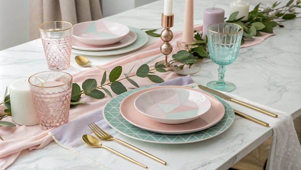
Soft Floral Table Arrangements
Soft floral table arrangements consistently emerge as the cornerstone of pastel-themed reception décor, transforming ordinary dining spaces into enchanting settings that captivate guests. By integrating flowers like hydrangeas, peonies, and roses in carefully curated combinations, these arrangements establish focal points that complement the broader design narrative while facilitating meaningful interactions among attendees.
The strategic incorporation of vintage glassware and natural greenery elements, such as eucalyptus garlands, elevates these arrangements beyond mere centerpieces. When combined with thoughtful color palettes like dusty blue with sage or sea glass with almond, these compositions create sophisticated visual harmonies that resonate throughout the venue.
- Layered arrangements featuring cloud-like hydrangeas paired with delicate baby's breath create ethereal focal points that draw the eye upward
- Mixed pastel roses intertwined with trailing greenery establish organic movement across table settings
- Clustered peonies in varying stages of bloom provide depth and dimensional interest while maintaining soft visual shifts
The integration of hanging installations above traditional table arrangements further amplifies the impact, creating a multi-dimensional experience that envelops guests in an atmosphere of refined elegance while maintaining practical sight lines for conversation.
Pastel Balloon Wall Designs
Pastel balloon walls have revolutionized event backdrops by offering a versatile and visually striking design element that transforms ordinary spaces into Instagram-worthy settings. The foundation of these installations begins with a carefully constructed base of foam board or wire mesh, which provides essential structural support while remaining completely concealed in the final display.
Creating an impactful balloon wall requires meticulous attention to technical details, particularly in the selection and application of materials. Low-temperature glue guns prevent balloon damage during assembly, while high-quality latex balloons in soft, complementary pastels guarantee a cohesive aesthetic. The installation process demands precise positioning, with balloons arranged in tight formations to achieve a seamless appearance.
To elevate the design further, contemporary balloon walls incorporate sophisticated elements such as metallic accents, pampas grass, and strategic lighting. These installations can be customized through the integration of marquee letters, botanical elements, or personalized signage. The versatility of pastel balloon walls extends beyond indoor venues, as exterior installations can be artfully blended with natural surroundings through the strategic placement of coordinating flowers and foliage.
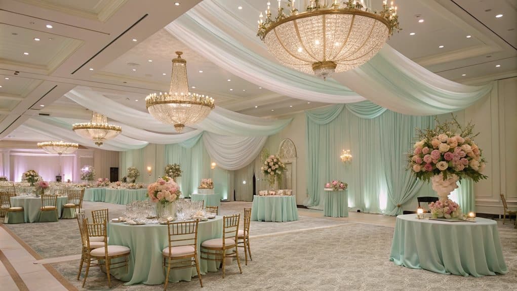
Dreamy Fabric Draping Effects
Transforming reception venues into ethereal wonderlands, dreamy fabric draping effects have emerged as a cornerstone of contemporary event design. The strategic integration of pastel hues, from baby pinks and ivories to soft lilacs and mint greens, creates an atmosphere of refined sophistication. These gentle color palettes can be expertly manipulated through various draping techniques to craft multidimensional installations, from whimsical sitting lounges to stunning entrance archways.
Metallic accents and floral chandeliers interweave with powder blue and peach drapes, creating depth and visual intrigue. Multi-layered fabric installations in blush and lavender transform ordinary spaces into architectural masterpieces. Gauzy textures combined with strategic lighting design produce an otherworldly ambiance perfect for evening celebrations.
The versatility of pastel draping extends across various wedding themes and venues, from coastal celebrations featuring slate blue and peach combinations to garden ceremonies where soft terracotta and mint green harmonize with natural surroundings. Modern event designers are increasingly incorporating innovative elements like citrus accents and dome-like structures to elevate traditional draping techniques, while maintaining balance through thoughtful color coordination with neutral tones and existing venue features.
Top Beauty Brands
Leading beauty brands offer comprehensive solutions for customers seeking to enhance their special events with pastel color palettes. Renowned companies like Charlotte Tilbury, Fenty Beauty, and Huda Beauty provide extensive makeup collections featuring soft, pastel shades that perfectly complement wedding themes, baby showers, and spring celebrations.
These brands offer professional makeup services, carefully curated product recommendations, and expert tutorials that guide customers in achieving their desired pastel-themed looks. With innovative products like Fenty Beauty's inclusive foundation range and Charlotte Tilbury's Airbrush collection, customers can create luminous, pastel-inspired makeup looks that photograph beautifully and last throughout their events.
Additionally, skincare experts like Drunk Elephant and goop guarantee that clients' skin is properly prepped and glowing, providing the perfect canvas for pastel makeup applications.
Pastel Wedding Invitation Designs
When designing pastel wedding invitations, several creative elements can be integrated to enhance their aesthetic appeal. Here are some key design aspects to ponder:
| Design Element | Description | Example Use |
|---|---|---|
| Watercolor Washes and Borders | Soft, blended pastel colors create a dreamy backdrop for invitation text. | A pastel pink watercolor border framing the wedding details. |
| Modern Typography Combinations | Pairing bold, modern fonts with delicate pastel hues adds a contemporary touch. | Combining a sleek sans-serif font with pastel blue accents. |
| Vintage-Inspired Floral Patterns | Intricate floral designs in pastel shades evoke a classic, elegant feel. | A vintage-inspired mint green floral pattern adorning the invitation's background. |
These elements can be combined in various ways to create unique and engaging pastel wedding invitations.
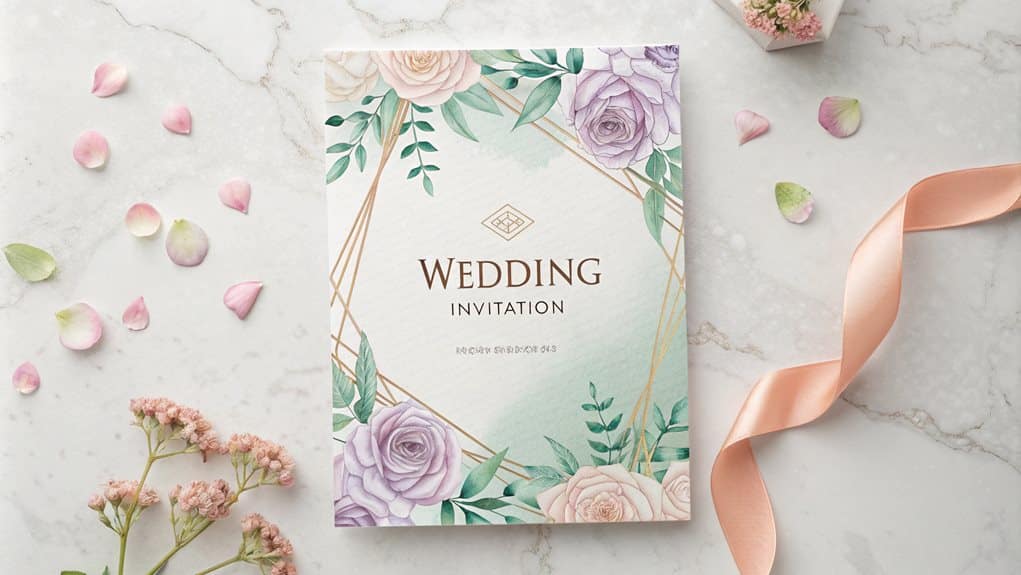
Watercolor Washes and Borders
The artful application of watercolor washes and borders brings an ethereal quality to wedding invitations, offering couples a versatile canvas for their special day. These distinctive designs combine subtle gradients with sophisticated foil accents, creating an interplay of texture and luminescence that elevates traditional invitation aesthetics. The integration of pastel palettes produces a harmonious blend of soft hues, while strategic placement of sparkling foil elements can simulate natural phenomena like streaming sunbeams.
Earthy neutral washes paired with pale pastels create an understated elegance perfect for sophisticated ceremonies. Free-form watercolor borders with metallic accents capture the essence of modern romantic aesthetics. Personalized, handwritten effects achieved through light wash techniques add an intimate touch.
Contemporary watercolor applications have evolved to accommodate various stylistic preferences, from minimalist designs featuring monochromatic washes to more elaborate compositions incorporating multiple color shifts. The technique's adaptability allows for seamless integration with formal elements such as foil appliques, while maintaining the distinctive softness that characterizes watercolor artistry. This versatility allows that each invitation suite can be tailored to reflect both the couple's personality and the event's overall aesthetic direction.
Modern Typography Combinations
Modern typography combinations have revolutionized pastel wedding invitation designs by merging elegant font pairings with soft color palettes. Through customizable font selections, couples can create sophisticated designs that incorporate handwritten, serif, and sans-serif typefaces, while varying sizes establish clear visual hierarchies that guide readers through essential information.
The integration of typography with design elements elevates the overall aesthetic, particularly when modern fonts complement blush peach ribbons and watercolor pastel liners. The interplay between bold or italic typography and backing materials, such as navy solid paper, creates compelling contrasts that draw attention to critical details while maintaining design cohesion. This sophisticated approach extends to the selection of pale blue or white envelopes, which provide a refined canvas for the chosen typography.
Professional customization services assure precise execution through live designer collaboration and multiple proof reviews. The thorough assembly process incorporates carefully selected materials, from premium paper stocks to coordinating ink colors, resulting in a meticulously crafted invitation suite. With efficient ten-day turnaround times and various delivery options, couples receive perfectly executed typography-forward designs that reflect contemporary sophistication while embracing the gentle appeal of pastel hues.
Vintage-Inspired Floral Patterns
Vintage elegance blooms through carefully curated floral patterns that transform pastel wedding invitations into romantic masterpieces. The harmonious combination of pale pink roses, blush peonies, and soft hydrangeas creates an enduring aesthetic that resonates with sophisticated couples seeking timeless design elements. These botanical selections, when paired with metallic foil accents in rose gold or classic gold, elevate the invitation's visual impact while maintaining its vintage charm.
Delicate wildflowers intertwined with lace details evoke nostalgic garden ceremonies. Soft pastel color palettes featuring blush pink and ivory inspire romantic sophistication. Intricate illustrations combined with letterpress techniques create depth and dimension.
The integration of design elements extends beyond mere aesthetics, functioning as a foundation for the entire wedding theme. By incorporating elements such as geometric frames and subtle glitter accents, modern interpretations of vintage styles emerge. The strategic use of greenery, particularly eucalyptus and sage in muted tones, provides natural balance to the composition while complementing the primary floral elements. This thorough approach aligns the invitation design with other wedding elements, from bridesmaids' bouquets to ceremonial decorations.
FAQ
How Do Pastel Colors Affect Guests' Moods and Behavior During Events?
Pastel colors induce calmness, enhance creativity, and evoke nostalgia, influencing guests to feel more relaxed, focused, and emotionally connected during events, while promoting an elegant and sophisticated atmosphere.
Can Pastel Themes Work Well for Corporate Events and Business Functions?
Pastel themes excel in corporate settings, offering sophisticated ambiance while promoting calm and focus. Their versatility allows seamless brand integration, making them highly effective for modern business functions and professional gatherings.
What Lighting Techniques Best Enhance Pastel Color Schemes at Night?
Strategic uplighting with LED washes, layered soft illumination, and color-temperature controlled spotlights create depth while maintaining pastel integrity. Diffused backlighting prevents harsh shadows and enhances ethereal ambiance.
Are Pastel Colors Appropriate for Cultural or Religious Ceremonies?
Pastel colors are highly appropriate for cultural and religious ceremonies, offering elegant solemnity while respecting traditions. They create serene atmospheres in Indian weddings, religious venues, and sacred celebrations.
How Do Seasonal Changes Impact the Effectiveness of Pastel Color Schemes?
Seasonal changes enhance pastel effectiveness through natural lighting variations and environmental backdrops. Spring and summer amplify their vibrancy, while winter and autumn create striking contrasts against deeper seasonal tones.