Beige has evolved far beyond its basic neutral reputation through centuries of sophisticated development and application. From ancient Egyptian ochres to modern synthetic compounds, beige pigments demonstrate remarkable versatility in both natural and manufactured forms. This adaptable color serves multiple practical purposes, from concealing dirt to creating expanded spatial perceptions through effective light reflection. In interior design, beige establishes itself as a foundational element that pairs seamlessly with earth tones, dramatic black accents, and contemporary color schemes. The color's journey from historical pigment to modern design staple reveals its profound impact across multiple industries and applications, with countless possibilities yet to be explored.
Historical Natural Dye Sources
Natural dye sources stretching back to ancient civilizations laid the groundwork. The discovery of dyed fabric remnants in Egyptian tombs proves humans were experimenting with natural pigments over 4,000 years ago.
Industrial Color Development Process
While beige colors are prevalent in modern design, their development in industrial settings follows a distinctly different path from traditional natural. The extensive mixing of White and Brown with primary colors creates the diverse range of beige tones used today.
Modern Synthetic Beige Creation
Modern synthetic beige pigments represent a significant advancement in color technology, emerging from centuries of reliance on natural earth-based materials. The development of these pigments began in the early 19th century with synthetic ochres in Germany, evolving through subsequent decades as chemical processes became more sophisticated.
Today's synthetic beige pigments primarily utilize iron oxides, titanium dioxide, and chromium oxides in precisely controlled combinations to guarantee consistent, stable colors.
The creation of modern synthetic beige involves complex chemical processes that yield highly stable compounds with superior characteristics compared to their natural counterparts. Manufacturers can now produce beige pigments with exceptional lightfastness and chemical stability by combining synthetic iron oxides with titanium dioxide, while utilizing trace amounts of carbon black for tonal adjustment. These engineered pigments demonstrate remarkable versatility in their applications, from industrial coatings to fine art materials, owing to their consistent particle size and purity. The controlled manufacturing environment verifies that each batch maintains identical color properties, making these synthetic beiges particularly valuable in applications requiring precise color matching and long-term stability.
Benefits

Beige's remarkable benefits extend far beyond its aesthetic appeal, offering practical advantages such as superior dirt-concealment properties and the ability to establish a timeless design foundation that simplifies home color coordination.
The color's inherent versatility allows homeowners to create sophisticated spaces that remain perpetually relevant, while simultaneously providing a sense of stability and calmness through its neutral undertones. These characteristics make beige an exceptionally practical choice for both residential and commercial spaces, combining functional durability with psychological benefits that promote relaxation and mental clarity.
Easy Home Color Coordination
Home decorators and interior design enthusiasts consistently praise beige for its remarkable ability to simplify color coordination in any living space.
This
Creates Timeless Design Foundation
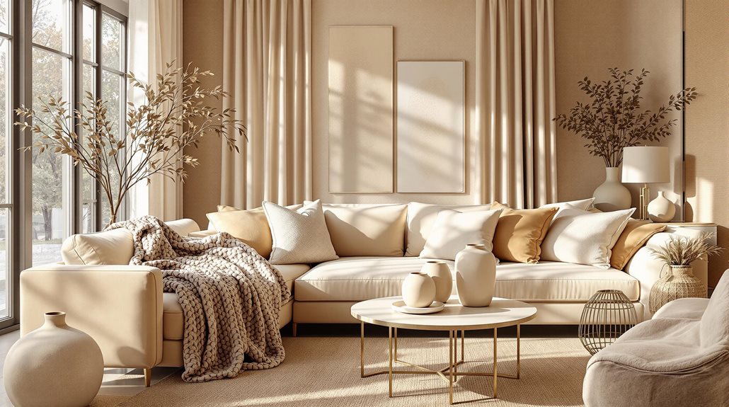
Interior designers and homeowners alike recognize beige as a cornerstone color that establishes an enduring design foundation for any space. This versatile neutral serves as a sophisticated backdrop that seamlessly adapts to evolving design preferences while maintaining its timeless appeal. Whether implemented in minimalist, Scandinavian, or traditional aesthetics, beige creates an adaptable canvas that accommodates various style shifts without requiring extensive renovations.
The color's inherent versatility extends beyond its aesthetic qualities to its practical applications in spatial design. By reflecting light effectively, beige contributes to the perception of expanded space and enhanced brightness, particularly beneficial in compact environments. This characteristic makes it an invaluable tool for creating enduring interiors that maintain their relevance across changing design trends.
In addition, beige's compatibility with an extensive spectrum of colors, from rich jewel tones to natural wood elements, guarantees long-term design flexibility. The color's ability to harmonize with both warm and cool palettes while supporting different textures and patterns establishes it as a fundamental element in creating sustainable, adaptable living spaces that retain their sophisticated appeal over time.
Calming Psychological Effects
While many colors evoke strong emotional responses, beige stands out for its remarkable ability to foster psychological well-being through its subtle yet powerful calming effects. Research demonstrates that beige creates an environment conducive to tranquility and relaxation, effectively reducing anxiety and stress levels while promoting a sense of stability. This neutral tone has proven particularly beneficial in therapeutic and healthcare settings, where it helps patients feel more at ease and supports rational decision-making processes.
The psychological impact of beige extends beyond mere relaxation, as it considerably enhances cognitive function by improving focus and concentration. In professional and academic environments, the color's neutrality reduces visual distractions, allowing individuals to maintain cle
Hides Dirt Well
Among beige's most practical attributes is its remarkable ability to conceal dirt, making it an invaluable choice for high-traffic areas in both residential and commercial spaces. This neutral tone effectively masks everyday wear, footprints, and minor stains, drastically reducing the frequency of required cleaning interventions while maintaining a consistently polished appearance.
The strategic implementation of beige surfaces extends beyond mere aesthetics, offering substantial maintenance advantages in both commercial and residential environments. Its effectiveness in concealing spills and everyday accidents makes it particularly beneficial for households with children and pets, while its compatibility with various cleaning methodologies guarantees long-term durability. The color's resistance to showing chemical residue or damage from cleaning agents further enhances its practical appeal.
Moreover, beige surfaces demonstrate exceptional longevity in maintaining their appearance, resisting considerable fading and discoloration over time. This characteristic, combined with the color's ability to mask minor scratches and scuffs, contributes to an extended lifespan of furniture, flooring, and upholstery, making it a cost-effective choice for both residential and commercial applications.
Interior Design Color Pairings

Beige's adaptability shines through its harmonious pairings with diverse color palettes, from bold navy blue statements to earthy brown undertones. The combination of beige with natural earth tones creates sophisticated spaces that reference organic elements while maintaining a refined aesthetic. When accented with modern black elements, beige transforms from a basic neutral into a foundation for contemporary design schemes that balance warmth with dramatic contrast.
| Color Combination | Best Rooms | Design Impact |
|---|---|---|
| Navy Blue + Beige | Living Room, Study | Creates sophisticated depth and maritime elegance |
| Earth Tones + Beige | Kitchen, Dining Room | Establishes organic warmth and natural harmony |
| Black + Beige | Bedroom, Office | Delivers modern contrast and architectural definition |
| Metallic + Beige | Formal Areas | Adds luxurious dimension and reflective elements |
Bold With Navy Blue
Despite its reputation as a simple neutral, beige takes on a sophisticated persona when paired with navy blue in interior design. This timeless combination creates a dynamic interplay between warm and cool tones, offering designers a versatile foundation for both traditional and contemporary spaces. The inherent warmth of beige effectively counterbalances navy's cooler undertones, preventing spaces from feeling overwhelmingly dark or austere.
In practical applications, this pairing manifests through strategic placement of elements: beige walls serve as a neutral canvas for navy accent pieces, while navy feature walls create dramatic focal points against beige furnishings. The combination proves particularly effective in larger spaces, where the contrast energizes the room while maintaining visual harmony. Designers often integrate this duo through varied textural elements, such as navy velvet sofas against beige textured wallcoverings or carpeting.
The sophistication of this pairing extends beyond mere aesthetics, creating environments that convey stability and refinement. By carefully balancing warm and cool tones, designers can achieve spaces that feel both grounded and innovative, particularly when supplemented with complementary accents in coral, turquoise, or metallic finishes.
Natural Earth Tones Combo
Harmonizing with nature's palette, beige finds its most authentic expression when paired with earth tones in interior design. The integration of sandy beige with rustic olive or deep forest green creates sophisticated spaces that echo the organic world, while combinations of harvest wheat and forest fern introduce warmth and significance to living environments.
For a more refined approach, beige can be layered with terracotta and ivory, establishing a mid-century modern aesthetic that balances contemporary sophistication with natural warmth. This versatile neutral also pairs exceptionally well with driftwood brown and sea salt tones, creating serene environments perfect for contemplative spaces. The incorporation of natural materials further enhances these combinations, with elements like jute, reclaimed wood, and stone adding textural depth and authenticity.
To maximize the impact of earth tone pairings, strategic implementation of soft lighting fixtures and carefully curated nature-inspired artwork can elevate the overall design. The addition of indoor plants and organic textiles serves to complete the naturalistic atmosphere, transforming ordinary spaces into harmonious sanctuaries that seamlessly bridge the gap between interior comfort and outdoor tranquility.
Modern Black Accents
Modern black accents introduce striking sophistication when paired with beige interiors, creating a dynamic interplay between light and dark elements. Through strategic placement of black architectural features and curved furniture pieces, these bold accents serve to ground neutral spaces while preventing them from appearing overly sterile. The incorporation of black-framed mirrors, organic-shaped lighting fixtures, and thoughtfully positioned accent walls establishes essential focal points that guide the eye through the environment.
The versatility of black accents extends beyond mere aesthetic contrast, as they can be integrated through various materials and textures to enhance the overall design composition. Natural elements such as wood paneling, stone surfaces, and leather upholstery, when combined with black accents, introduce layered complexity to beige spaces.
The implementation of black trim around windows and doors, coupled with textured wallpapers or curved furniture pieces, creates a sophisticated balance between contemporary and timeless design elements. This intentional fusion of materials and forms allows beige interiors to transcend their basic neutral foundation, emerging as refined spaces that showcase both warmth and architectural distinction.
Top Beauty Brands
Leading beauty brands like Chanel, Dior, and Lancôme have masterfully incorporated beige into their brand aesthetics, demonstrating how this versatile neutral can elevate product packaging and marketing materials. By adopting similar design principles, businesses can create sophisticated product presentations that resonate with luxury-seeking consumers.
Professional beauty consultants and packaging designers can help brands develop cohesive color strategies that utilize beige as a foundation, complementing it with strategic accent colors and textures to create memorable brand identities. This approach not only enhances shelf appeal but also builds consumer trust through consistent, high-end visual presentation, ultimately driving brand recognition and customer loyalty in the competitive beauty market.
Automotive Paint Color Trends
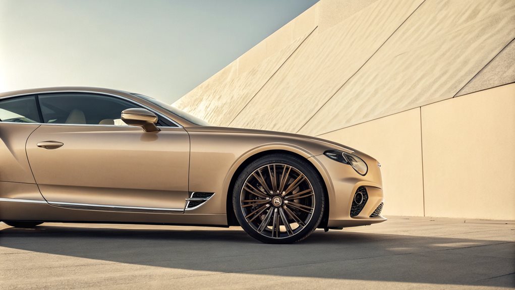
The automotive industry is witnessing a significant shift in paint color trends, with beige emerging as a versatile and increasingly popular choice. This trend is reflected in the growing sales of beige cars, particularly in the luxury market, where design nuances are highly valued. Here is a snapshot of how beige and other colors are evolving in automotive paint:
| Color Trend | Description |
|---|---|
| Growing Beige Car Sales | Beige is gaining traction due to its neutral yet distinctive appeal, especially in luxury vehicles. |
| Luxury Market Design Shift | Luxury car manufacturers are incorporating more unique and sophisticated color options, including various shades of beige and pastel hues. |
| Factory Paint Color Evolution | Factories are developing colors using renewable, recycled, and bio-based materials, such as the sustainable components in HARBINGER'S INK and the innovative surface designs enhancing metallic colors. |
This evolution not only meets aesthetic demands but also aligns with sustainability and functionality goals.
Growing Beige Car Sales
Despite its historical prominence as a staple neutral shade, beige has experienced a dramatic decline in automotive paint popularity over the past two decades, with current market share plummeting to less than 1.3% of new car sales in the United States. This significant decrease, representing more than an 80% reduction in market share, reflects evolving consumer preferences and industry dynamics that favor more contemporary color choices.
The diminishing appeal of beige can be attributed to several key factors, including the superior durability and maintenance characteristics of grayscale alternatives. Modern automotive manufacturers and consumers increasingly prioritize colors that maintain their aesthetic appeal and resale value, areas where beige has demonstrated limitations compared to white, black, and silver options.
Additionally, technological advancements in paint manufacturing have enhanced the visual qualities and longevity of grayscale colors, further accelerating beige's decline across all vehicle categories.
Market analysis indicates this downward trend is likely to continue, as emerging automotive technologies and sustainability considerations shape future color preferences. While customization options through automotive wraps provide alternative paths for beige enthusiasts, traditional beige paint continues to face significant challenges in regaining market relevance.
Luxury Market Design Shift
Breaking from traditional automotive color conventions, luxury manufacturers are orchestrating a dramatic shift toward bolder and more personalized paint options, while maintaining strong representation in classic white and black finishes. This evolution is exemplified by distinctive offerings like Aston Martin's Lime Essence and Lamborghini's Blu Glauco, which demonstrate the industry's movement toward more expressive aesthetics.
The transformation extends beyond singular hues, incorporating advanced paint technologies that produce complex effects and color-shifting properties. BASF's 2024 Automotive Color Trends Collection illustrates this progression with transparent blues and innovative pastel variations, while regional influences contribute to the diversification of luxury vehicle palettes. In Asia Pacific, light green tones are gaining prominence, while European markets embrace sophisticated pastel iterations.
This design revolution reflects a deeper industry response to evolving consumer preferences, where personalization has become paramount. While white and metallic white continue to dominate the luxury segment, accounting for over one-third of new vehicles, manufacturers are strategically expanding their color portfolios to include options like Rolls-Royce's Twilight Purple and BMW's Sao Paulo Yellow, catering to clients seeking distinctive automotive statements.
Factory Paint Color Evolution
Modern automotive paint colors have branched out into innovative territories, driven by advances in sustainable materials and evolving consumer preferences across global markets. Factory paint offerings now incorporate sophisticated dual-tone effects and innovative surface designs, particularly evident in metallics enhanced with fine particle effects for unprecedented radiance. The evolution extends beyond aesthetics, with manufacturers integrating biodegradable pigments and carbon-negative components into their color development processes.
Regional preferences considerably influence paint evolution, with Asia Pacific and European markets embracing vibrant options for compact vehicles, while the Americas maintain a strong preference for neutrals in larger vehicles.
Technological advancements have transformed traditional color categories, with new reds featuring intense purple undertones and dark achromatics energized by dynamic effects that transcend conventional solid black.
Sustainability drives innovation through low-emission basecoat technology, as exemplified by SCINTILLATION's warm gray liquid metal effect and HARBINGER'S INK's implementation of renewable components.
These developments mark a significant shift from conventional automotive finishes, demonstrating how factory paint options continue to evolve through technological advancement and environmental consciousness while maintaining market relevance.
FAQ
Can Beige Clothing Make You Appear Older or More Dated?
Beige clothing can age one's appearance when worn without strategic styling. The color's potential washing-out effect and association with conservative fashion requires thoughtful accessorizing to maintain a contemporary, vibrant look.
How Does Beige Appear Differently Under Various Types of Lighting?
Beige transforms markedly under different lighting conditions: appearing warmer and more vibrant in natural light, while artificial lighting can create cooler tones, with intensity and direction further influencing its perceived depth and richness.
Is Beige Considered a Warm or Cool Color Tone?
Beige is definitively classified as a warm color tone, created by mixing white with brown pigments. Its inherent warmth comes from yellow and brown undertones present in its composition.
Why Do Some Beige Fabrics Yellow or Fade Over Time?
Beige fabrics yellow due to environmental exposure, chemical reactions, improper storage, and fiber degradation. Heat, light, oxidation, and cleaning products accelerate this process, while additives and contaminants contribute to discoloration.
Does Beige Look Different on Computer Screens Versus in Real Life?
Beige appears differently on screens due to variations in display calibration, color profiles, and resolution. Physical beige clothing exhibits more nuanced undertones and texture details than digital representations can capture.